As the Prince of Morocco stood over three caskets of lead, silver, and gold in Shakespeare’s Merchant of Venice, he faced a decision. If he found the fair Portia’s image inside, she would be his bride. Hearing the gold casket would contain “what many men desire,” he made his choice. We’ve all been there, right?
Of course, inside he found “a carrion death within whose empty eye there is written a scroll.” Many will recognize the opening lines of that scroll: “All that glisters is not gold—often have you heard that told.” A bit of wisdom for us all, I believe. “Gilded tombs do worms infold,” he said. Man, the Bard had a way with words.
Obviously, the wisdom applies in the attempt to secure a class-driven marriage, but does it work with board games? Can we judge a game by its cover? Even if we can, considering the equally sage words of Dr. Ian Malcolm, should we do so?
I say yes on both counts.
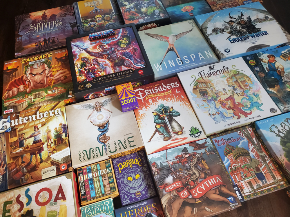
I say so with gusto, but also with the caveat that I’m not foolish enough to believe we can know everything about a game based solely upon its crafted cardboard exterior, no matter how well it advertises what’s inside. There are good games with ugly, uninformative, and terribly designed boxes. Some of them even have bad names and, consequently, give love a bad name. There are boxes of every ilk out there.
But I do believe there is much to learn from a game’s box. If you are just getting into the hobby, these six items might help you process particulars that are wholly new to your eyes. If you’ve been around a while, maybe they’ll resonate as ways you quickly filter through new titles. Maybe you think I’m a loon for even attempting to suggest that this is OK. I can live with that, too. They appear here in the order I typically scan the cardboard—your eyes may move differently. If so, tell me about it below.
Art: On the evocative
Board games have artists whose work cries out from afar. Before you ever find out their name or even the title they depict, you will pass several judgments on their work. I appreciate that artists’ names are increasingly printed on the box with the game’s designer, but I am most inclined to learn the name when the art is already speaking.
There is a blend of art and graphic design in tabletop games, both the evocative images and the skill with which they are implemented. Graphic designers don’t receive nearly the recognition of the artist, but their work can definitely make or break a beautiful cover. The decision to employ white space—my personal gaming aphrodisiac—might be one degree removed from the artist, but it is the joint labor that creates harmony or dissonance. Artwork properly laid out wrestles eyes away from the noise and stirs the imagination (and, reader beware, the purse strings).
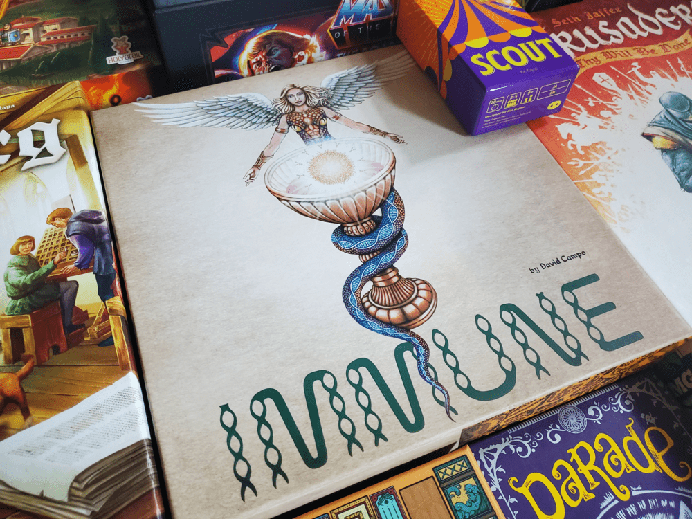
I do not presume to tell you what sort of box art qualifies as good. But I can tell you that a well chosen piece of artwork that is fitting to the box shape and size so as to be considered beautiful can sell a game or at least make it appear far more interesting. I acknowledge that I am infinitely more likely to pick up a box if the artistic presentation tugs at my attention like a toddler scheming his dad for a lollipop.
Sometimes, from across the room, we say things like, that’s Vincent Dutrait, I know it. Or maybe we’re pleasantly surprised by a new artist we could’ve sworn was Andrew Bosley. The shelves of a game store are like an overpacked art gallery, and a box needs to pop. Publishers know this, and they exercise care with first impressions. How they’ve proposed to trigger this love at first sight is worth considering.
Title: On approachability
Board games have titles and subtitles that interact with the rest of the box as well as the gameplay. There are a number of games that I have hesitated to try because of a name. There are games I’ve passed by on the shelf because the name didn’t seem right. Occasionally I’ve come back around to find I was wrong, but a title must roll off the internal tongue, so to speak. (I don’t know about you but I don’t walk around repeatedly uttering a name aloud to see if it resonates with my soul.)
Sometimes an odd title works. Moongha Invaders: Mad Scientists and Atomic Monsters Attack the Earth! Is a mouthful but it perfectly matches the campy cover graphics and the even campier gameplay. Single words like Root have a lot to communicate with few letters. Places, while helpful, often rouse preconceived notions unrelated to board games. Are you really interested in Jaipur the game, or Warsaw: City of Ruins, or were you simply there once? I would argue the same is principally true for Marco Polo, Fernando Pessoa, or a host of other human names. Who can fathom what runs through a human brain upon hearing a name? I do not envy design and publication teams trying to put it all together.
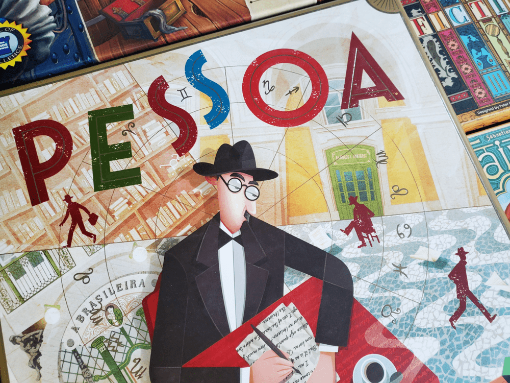
When a box catches my eye, I try to give time to the cover asking myself what might be going on inside based on the name and the image. Together, they tell me to expect gravity or whimsy, strategy or serendipity, puzzle or party. Whether I take up the box in my hand is often determined just by these two. Even as I play, my mind circles back to this initial impression for validation that I received what I expected.
Author: On sensibility
Board games have authors like any novel. Their name carries a catalog, and that catalog carries certain expectations. Readers who take up a Stephen King novel know some of what they’re getting into. Likewise for Cormac McCarthy (rest in peace), William Shakespeare, or Dr. Seuss. There is a watershed moment in tabletop gaming that accompanies the realization that Milton Bradley himself did not design every board game, and that there are thousands of creators out there authoring a wide variety of entertainment, all with a personal touch.
At the doorstep of the hobby, there’s not much to be done with this information. But once you’ve enjoyed a game or two, it helps to know the designer’s name. In a way, I feel like I was welcomed into the hobby by Antoine Bauza. His titles have been like a warm blanket almost from the beginning. Amid a panoply of colors, images, and titles, I felt like I could trust the name on the box once I was comfortable with Tokaido, 7 Wonders, and Hanabi.
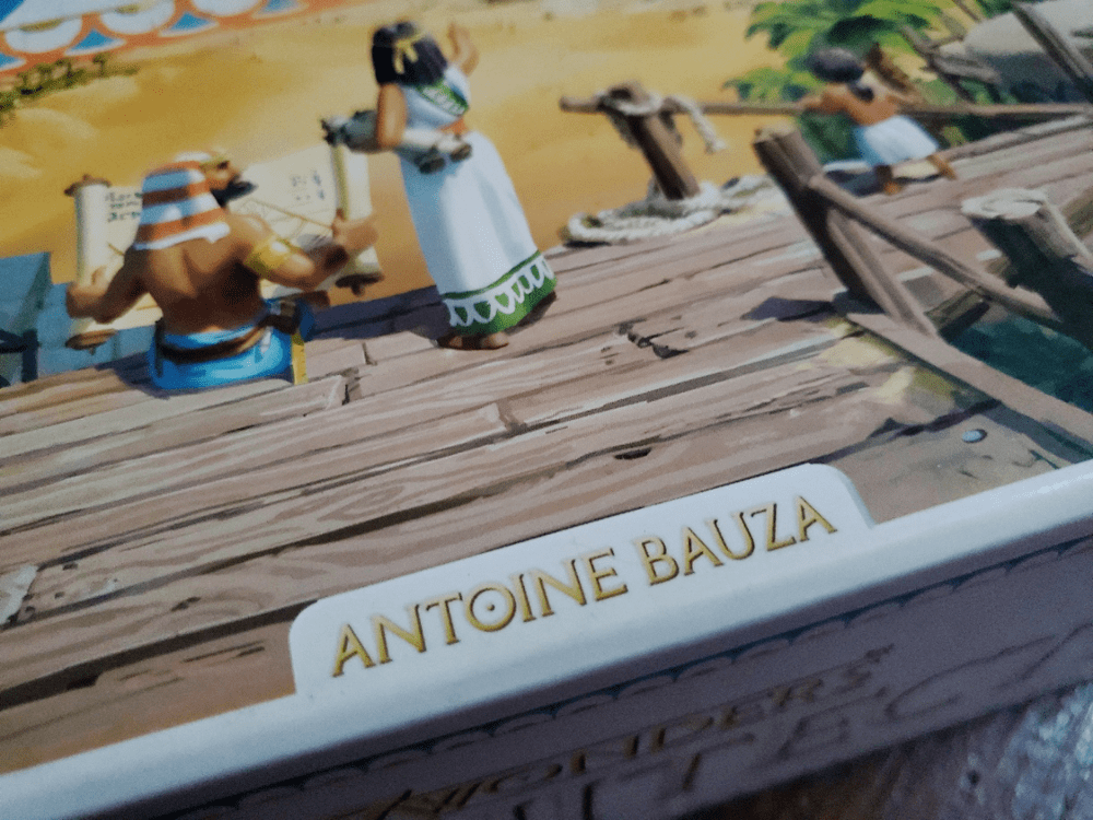
With so many designers, you’re not likely to stay with one forever (though you might find great joy in Focusing on Feld or Ave-ing Uwe), but you might pick up 7 Wonders Duel and ask who this Bruno Cathala person is that worked with Bauza and you’re off to the races. Or maybe you take a chance on a less familiar name, only to discover the work of an Adam West, David Chircop, Dan Hallagan, or Alf Seegert. Games have personalities behind them. Every author brings their own sensibilities to an experience, so we should not be inconsiderate of the name on the box.
Publisher: On quality
Board games have publishers like any novel, and that brand name says something about the contents. Far more games come to market from the independent side of the publishing continuum, though, and every name also comes with signals, catalogs and identity markers that communicate.
Sometimes the signal is an overall package akin to the Garphill catalog where the game designs of Shem Phillips are clothed by the art of the Mico and broadcast by the Garphill font (is that a proprietary font?) in a way that you can spot one from across county lines. Most often, though, the signal is just the little logo in the corner whispering a word on the manufacturing philosophy.
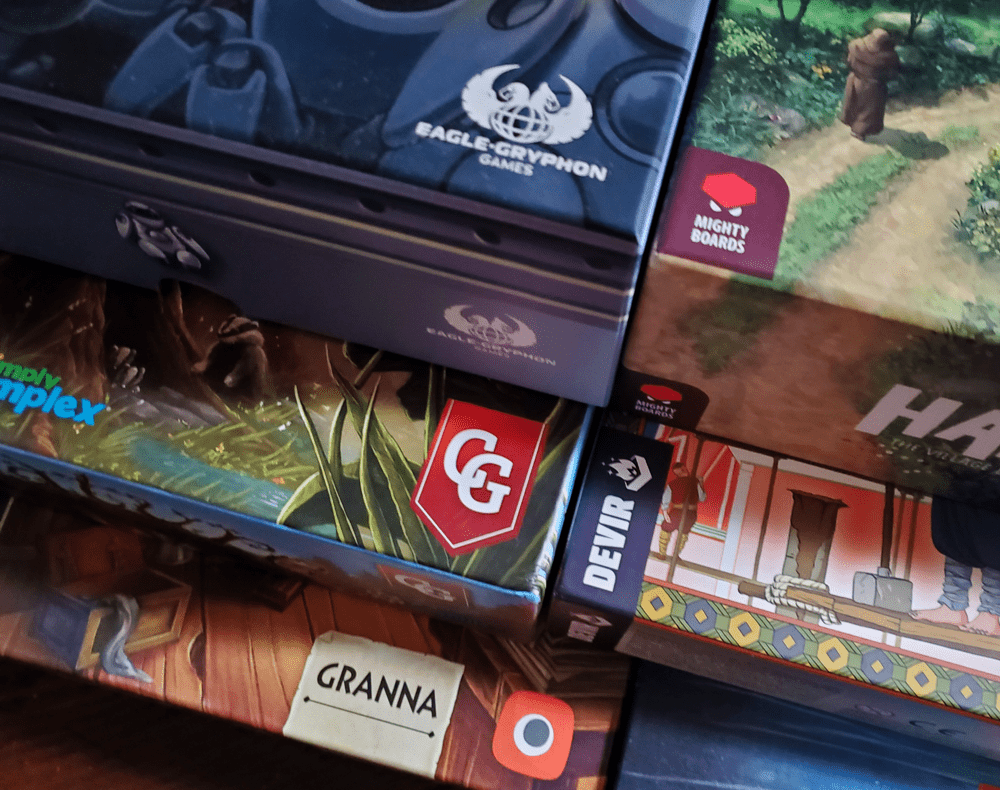
When you pick up a title from Capstone Games or Eagle Gryphon’s deluxe line, you know it will be done up to the nines with solid components. You know you’re getting 18 clever cards from Button Shy, small box delights from Oink, high-profile intellectual properties from Funko, education-adjacent experiences from Genius Games, and miniature-laden wonderlands from CMON. Publishers often have a wheelhouse of sorts, and you learn what you’re getting into over time: the plastics, woods, and cardboard thicknesses, the usefulness of a rulebook, the storage solutions.
Oddly, none of these things are the game itself. And yet, every last detail flashes through my head when I look at a box, gently (or sometimes less gently) informing my decision whether to pick up the box. Speaking of which, it’s time to actually pick up the game.
Weight: On tangibility
Board games have meat inside: muscles, sinews, even fat, and a lot of it is communicated by the fruitfulness of gravity upon the box. Is the box inordinately large yet feels like it’s filled with Helium? Is the box so heavy that you wonder if it’s filled with lead? (Chances are it’s filled with endless punchboards of tokens.) There is a brief moment when my hand closes on the box and I lift that I cast yet another judgment on the game.
I remember grunting when I lifted Ierusalem: Anno Domini for its heft. I remember almost accidentally throwing Planet across the room for its lack of heft. Neither says “this game is better.” But they communicate. The title, the artwork, the designer’s name, and publisher’s ilk converge on the key moment of the lift.
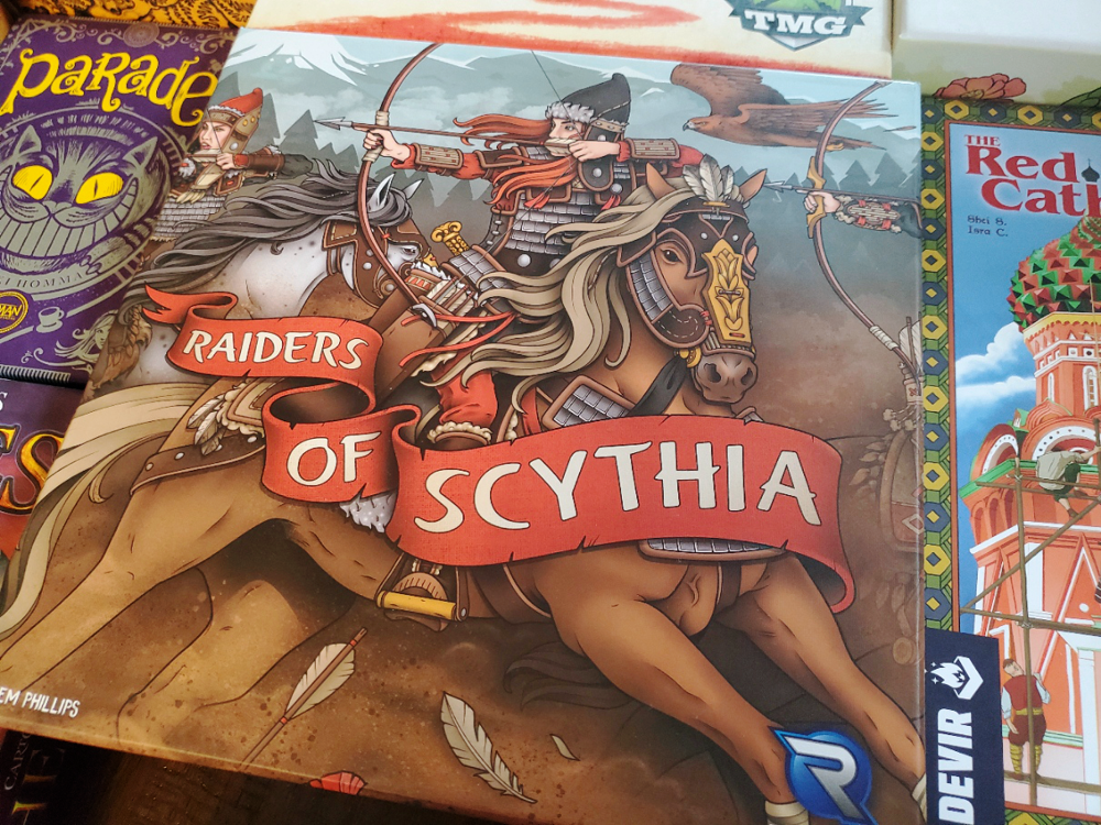
Though this is a slight sidebar, I would also call out in this moment the weight of the box itself. When you pick up The Isle of Cats, you turn the box over to see just how thick the cardboard is. Sometimes a publisher throws all caution to the wind and wows you with the container. Other times you feel as though you might tear the corners of the box with a cross look.
Of course, this is the moment when we look at the price, is it not? We are holding all of those tangibles and intangibles with our eyes on a number and we judge. I am astounded how deeply my emotional attachment (or detachment) to a game has been forged by this point. I know almost everything I am interested in knowing. My heart has prompted my head. My head has reacted. My hand might already be putting the game down, maybe to excitedly pick it up again in search of lightning, or maybe to walk away.
Again, girth does not necessarily equal mirth. Weight is no determining factor, but rather a data point in a sea of sensory perception.
Tags: On subjectivity
Board games have intended audiences, but the information is as precise as your average weather forecast. I find the three most useless markings on a box to be the obligatory player count, age recommendation, and play time.
The player count should instead say, “components included for ____ to ____ players,” because we all learn quickly that just because a game says four players doesn’t mean it’s fun with four players. The age recommendation should say, “the pieces of {title} are not fit for human consumption.” Most games are rated 14+ because that is the age at which the majority of humans will instinctively decide against eating the pieces, not because of any ability to grasp the rules.
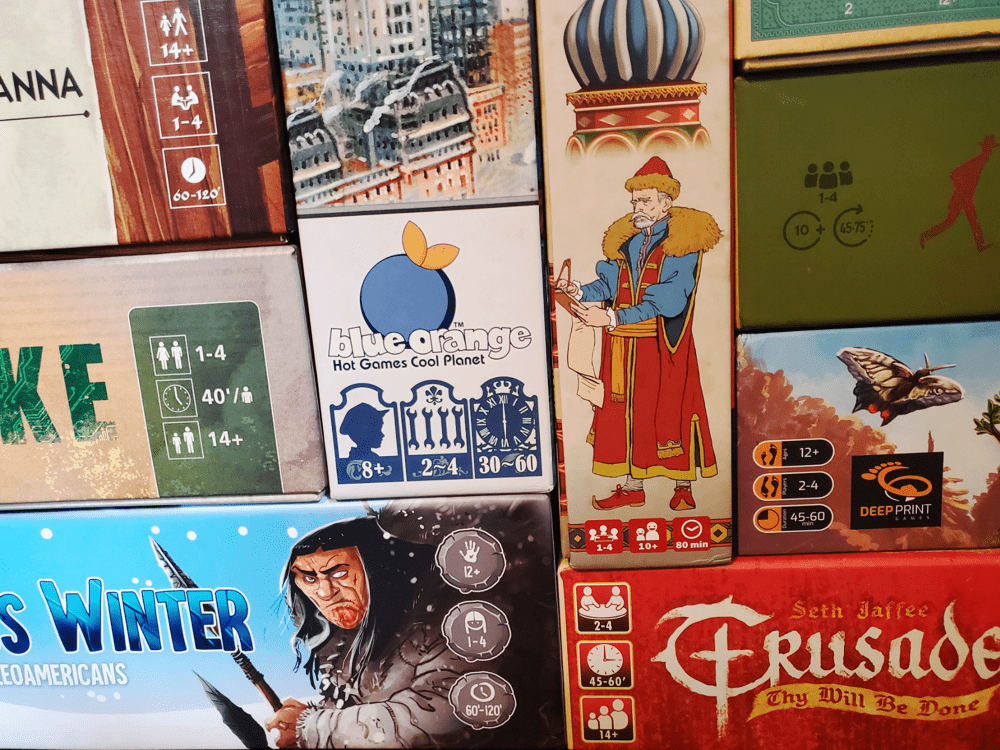
Play time is the grandest myth of all. I would venture to say we play roughly 20% of the games in my collection according to the play time printed on the box. We are a casual play family, and we have quite a few casual play friends. We don’t sit down to see how many games we can finish in a night, we sit down to enjoy each other, coffee, dessert, and often a single game played for way too long. If a publisher printed our play times, they’d scare off the entire marketplace.
I share all this to say this is how I read the tags. They are utterly unimportant unless they are so unusual that they warrant consideration. Solo games are not for four players—duly noted. A game that says 4+ will play differently than those games aged 10+ or 14+ (though the artwork, title, and publisher are more likely to tell me than the age recommendation). And a tag that says 180-240 minutes, for our family, means schedule a weekend (or two) for play. These anomalies aside, I’m not sure the tags matter all that much if I’ve not already been dissuaded by the art, graphic design, title, designer, publisher, and weight. They’re just…there.
Now it’s your turn
Do you judge games by their cover? If so, how? Are there additional factors that you take into account? In this digital era, it’s always possible to read reviews, read rulebooks ahead of time, investigate the Kickstarter campaign page and creep on the designer’s social media accounts. But in the heat of the retail moment, what gets your heart rate up? What disappoints you? I’d love to know in the comments below.
In the meantime, judge well, my friends.


