Disclosure: Meeple Mountain received a free copy of this product in exchange for an honest, unbiased review. This review is not intended to be an endorsement.
In early 2019, two archaeologists working a new dig site in Kyushu uncovered a peculiar relic: a series of tablets inscribed with the rules of an ancient game. These rules, nearly complete, describe a game played using river stones and a length of rope. Inspired by their discovery, the archaeologists made it their mission to revive this forgotten treasure and bring it to the modern global board game market.
Well, not really. But looking at a copy of SHŌBU, it’s not hard to feel that there must be some far-off origin to what is — in reality — a very young game.
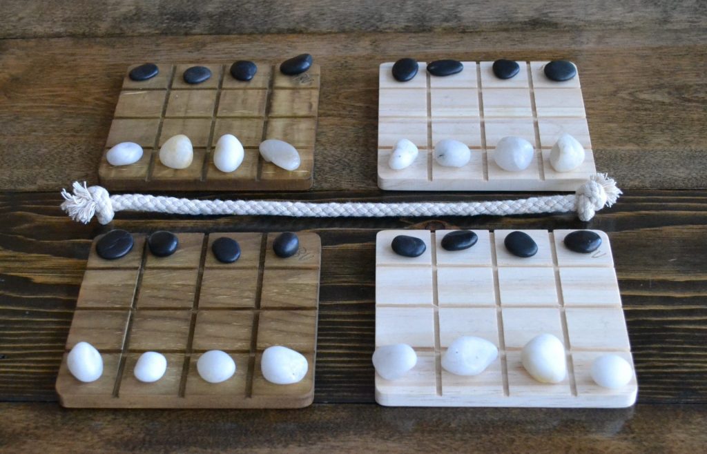
SHŌBU is a 2019 abstract strategy game that goes out of its way to evoke the understated elegance of ancient games. Opening its lid, you’ll find four wooden boards, 32 river stones in black and white, and a single length of rope. As cheesy as it might sound, SHŌBU genuinely does look like something that might have been played thousands of years ago.
And much like the games it tries to evoke, SHŌBU’s rules are deceptively simple.
How to Play
SHŌBU presents an unusual premise: each of its four boards is a self-contained battle between the two players. Players take turns maneuvering their stones, hoping to push opponent pieces off the board. If all four of a player’s stones are lost on any single board, the game ends in victory for their opponent.
What makes SHŌBU uniquely interesting is the unusual way these boards interact, which stems from the novel layout of the game.
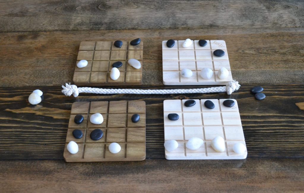
SHŌBU has four boards: two dark, two light. A rope divides the center of the playing area with a light and a dark board on each side. We’ll call the boards on your side of the rope your home boards.
On your turn, you get to move two stones.
Your first move is pretty simple: choose any one of your stones on either of your home boards. Move that stone one or two spaces in any single direction (including diagonally). This is called your passive move, and for good reason: it may not interact with an opponent piece in any way, meaning you have to move to an empty space. The passive move is the set-up for the move that follows.
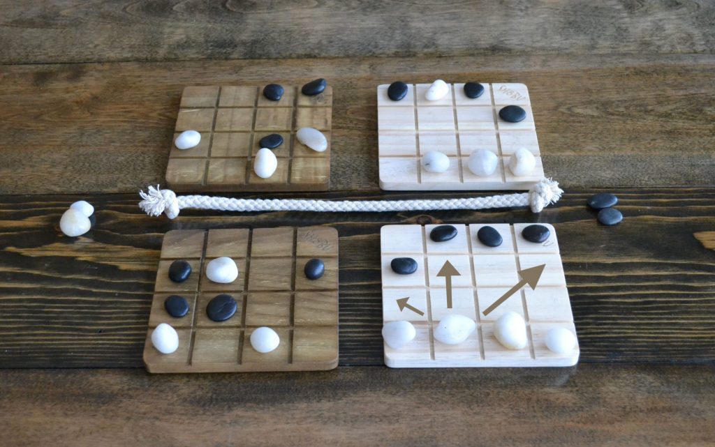
Your second move of the turn is called your aggressive move. Choose one of your stones on a board of the opposite colour of the one you just performed your passive move on — whether it’s your home board or your opponent’s doesn’t matter. Now, make the exact same move you did with your passive move in both direction and number of spaces. There is, of course, a twist: this move can push an enemy stone off the board.
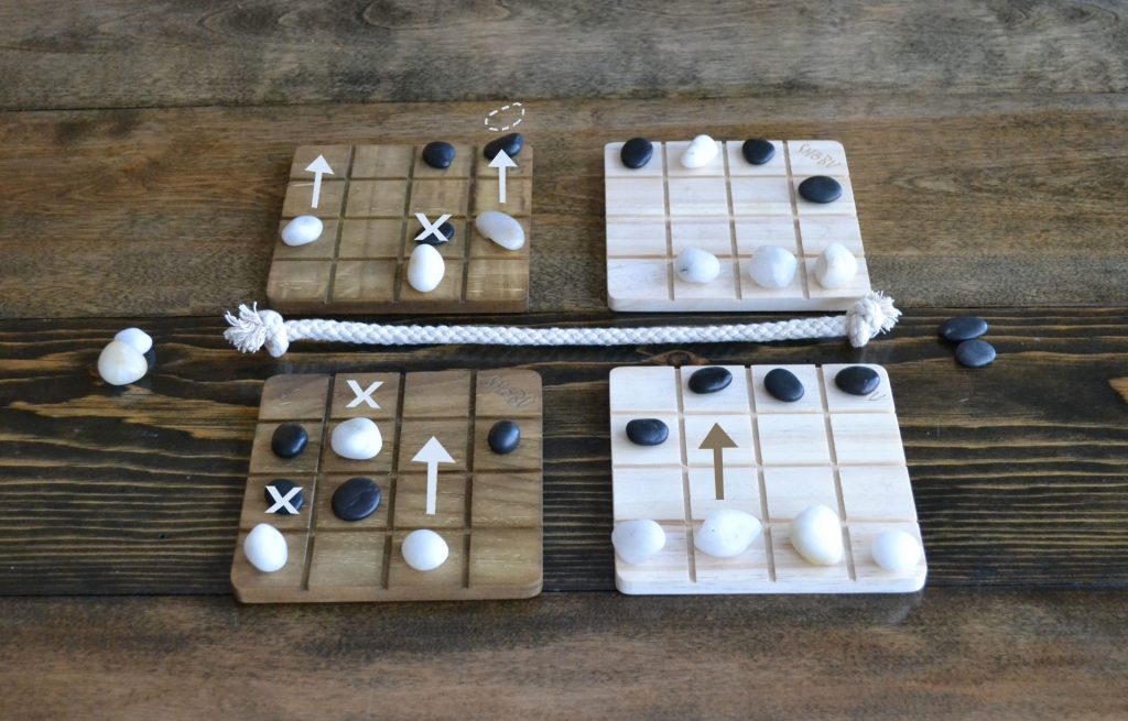
Suddenly, SHŌBU is no longer four separate battles being carefully waged in isolation. With the mirrored dance that connects the four boards, SHŌBU turns into a game of carefully pulling the slingshot back… then releasing when the rope is taut.
How to Think
I’m a big fan of abstract strategy games. In my eyes, something very special happens when a game decides that there will be no surprises… except, of course, for the carefully guarded plans of a clever opponent. This holds true for SHŌBU, which doesn’t hide any information from the players. Many things are familiar in SHŌBU’s design: jockeying for position, making calculated sacrifices, knowing when to defend your own stones or threaten your opponent’s — these are not new ideas.
Still, SHŌBU manages to innovate.
The most obvious twist is its mirrored moves. Players have to position themselves on one board while simultaneously going for the jugular on another. This kind of remote-controlled attack can really tie your brain in a knot: is this an opportunity to push her last stone off the board? Well, maybe — but only if I have room to make that move on my home board first.
In this way, each move has two implications. First: am I putting myself in a precarious position? This is pretty common in abstract strategy games, since what appears to be a good offensive move might leave you wide open for a counter-attack. It’s the second implication that’s so strange — if I move here, will it mean I have no power to manipulate the other board on my next turn? Maybe this is the perfect spot defensively, but it also means there’s no way to push that last stubborn stone off the edge next turn. It’s a juggling act, and an interesting one.
SHŌBU’s other quirk is its size. By using a 4×4 grid for each board, SHŌBU makes a battlefield small enough that there are literally no safe spaces. Every space on the board can be cleared off by a well-placed stone. Having more than one small board neatly avoids making a cramped fight feel like a cramped decision space.
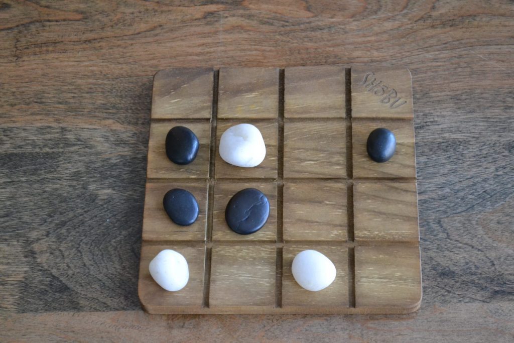
But I’m willing to bet that if you heard about SHŌBU before reading this review, it was not for its mechanical design. No, SHŌBU’s boldest design choices lie in something different: its aesthetic.
How to Design
People love games. Whether it’s the thrill of victory or the quiet fascination of unpacking a curious puzzle, there are many ways to enjoy a new game. What is more difficult is getting people to play that game in the first place. With most contemporary games, themes serve as a kind of catalyst to attraction: who wouldn’t want to be a giant silkworm farmer? Abstract strategy games don’t get to use this trick, so they have to be a little more creative.
Luckily, there are a few tried and true ways to sell an abstract strategy game.
First, we have the brute force option: give it a theme anyway. It may not be pretty, but it gets the job done. Battle Sheep could easily have been coloured tokens on a board, yet a thin tale of cheerleading towers of sheep warring over pastures makes it seem more accessible. Then there’s Santorini, which couldn’t be bothered to decide on a theme, so decided to go with “this is a game about Gods… playing a game.” It works, sort of.
A second common approach to making an abstract strategy game appealing is to nest it in a larger series. As a standalone game, you might overlook the rings and grids of Kris Burm’s DVONN. But DVONN is just one game in a beloved series known as Project GIPF, which includes celebrated games like YINSH. Likewise, Gigamic’s series of abstract strategy games all have a polished, unified aesthetic that lifts up the whole line. This makes lesser-known titles like Squadro get a little more of the attention they deserve.
Other games lean into their abstract nature, making no effort to hide the mechanisms that power their gameplay. This strategy has some successes, but with the rising level of production value in modern board gaming, some great games that try this struggle to find their market, like Push Fight for example. The challenge here is that as a perfect information game your brand new design is going to be compared to ancient games with centuries of history. How do you make a game feel important and interesting when its competition is not just a classic, but a cultural artifact?

For SHŌBU, the answer was as clever and simple as the game itself: make it look like it’s as venerable as its de-facto peers. It’s almost like using a cheat code. And if you look into the (much shorter) history of SHŌBU, you begin to see that this was a very intentional decision.
SHŌBU’s two designers may both be new to the board game world, but they’re not strangers to design. Both Manolis Vranas and Jamie Sajdak are professionally trained industrial and product designers. Knowing that, it’s no surprise that their classy, minimalist design has resonated with players and their publisher.
Smirk & Dagger Games are not known for abstract strategy. Quite the contrary — the majority of games in their decade-long lifespan have been backstab-your-buddy designs that lean heavily into their themes. In spite of this, when Curt Covert — Smirk & Dagger’s founder — saw SHŌBU at a local design conference, he couldn’t resist the urge to publish it, almost exactly as originally designed. It wasn’t necessarily an easy task: because of its unique materials, Smirk & Dagger had to seek an alternative printing partner to preserve SHŌBU‘s natural aesthetic.
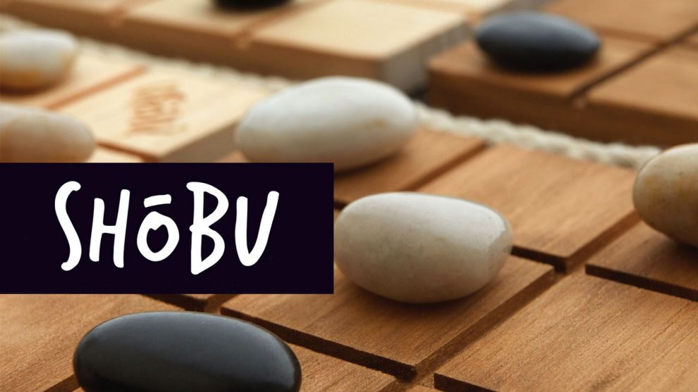
All this work eventually proved fruitful. SHŌBU’s wooden boards and river stones could feel tacky… but they don’t. They convey just what they set out to. They give SHŌBU an air of importance and thoughtfulness that makes it impossible not to pick up the pieces and turn them over in your hands. I have been asked by multiple people now: “are they real stones?” Well, yes — but it almost doesn’t matter. Each playing piece is comfortably weighty and uniquely oblong, lending the game a handmade, artisanal feeling.
Even the rope serves a function — in a game where the relationships between boards is particularly important, it’s nice to have a tangible way of separating them. That being said, I do like an unnamed friend’s enthusiastic idea… “When you win the game, you swing the rope around over your head and shout SHŌBU!”

The game may be elegant, but that doesn’t mean you have to be. I recommend taking some time to dive into SHŌBU. The well is as deep as it looks.






Surprised that this review didn’t mention Tak, which had similar design and aesthetic goals.