In an alternative history’s 1920s, Europa finds five surviving factions working to expand their territory to become the most powerful realm. This is a world where Steampunk mechs live alongside the wealthy and the poor, where resources are traded to upgrade abilities, and where the closed city-state known as The Factory promises additional abilities. And now, even better, this world has come into the digital domain!
Introduction
Meeple Mountain writer JP wrote on his appreciation for Scythe several years ago. His review covered the world that Scythe creates and the depth of play the game provides. Luckily, the digital version of Scythe builds solidly on both of these factors, so let’s dive right in.
NOTE: This review assumes that you already know how to play the analog version of Scythe. If you’re unfamiliar with it, then we highly recommend Rodney Smith’s “Watch it Played” tutorial.
Opening the App
One of Scythe’s most striking aspects is the undeniably beautiful artwork by Jakub Rozalski. That artwork is on full display in the digital version. For anyone who looked at any of the artwork and wished it was bigger, just take a look at one of the many start screens for the game.
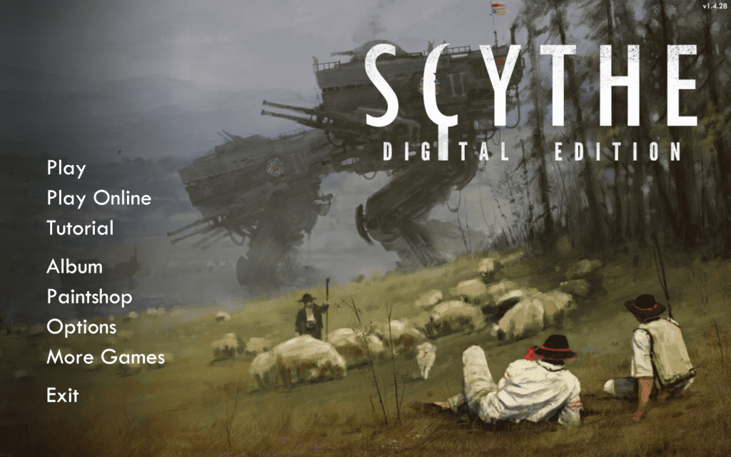
Whether clicking on Play or Options, you’ll be taken to an Options screen that allows you to determine the kind of game you’d like to play.
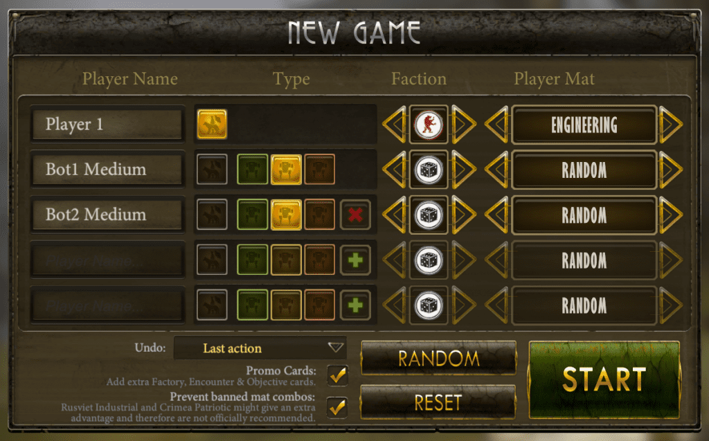
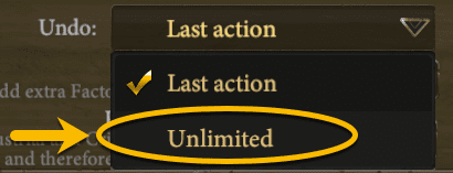
While most of the options you need to click on are very clear, it can be tricky to be certain you’ve completed all of your actions as you intended. If you’re new to the digital game, I recommend making one important change here: changing the Undo from Last action to Unlimited.
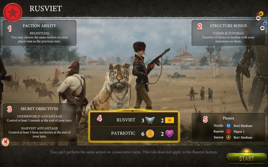
After clicking the large START button, you’ll be shown the faction you’ll be playing, along with all of the initial information you need to know to start the game.
Clicking START in the lower right corner of your screen will generate the board with all factions, characters, and workers in their appropriate starting places.
Playing the Game
There is a lot of information packed into the main screen. Here’s an overview of what’s there:
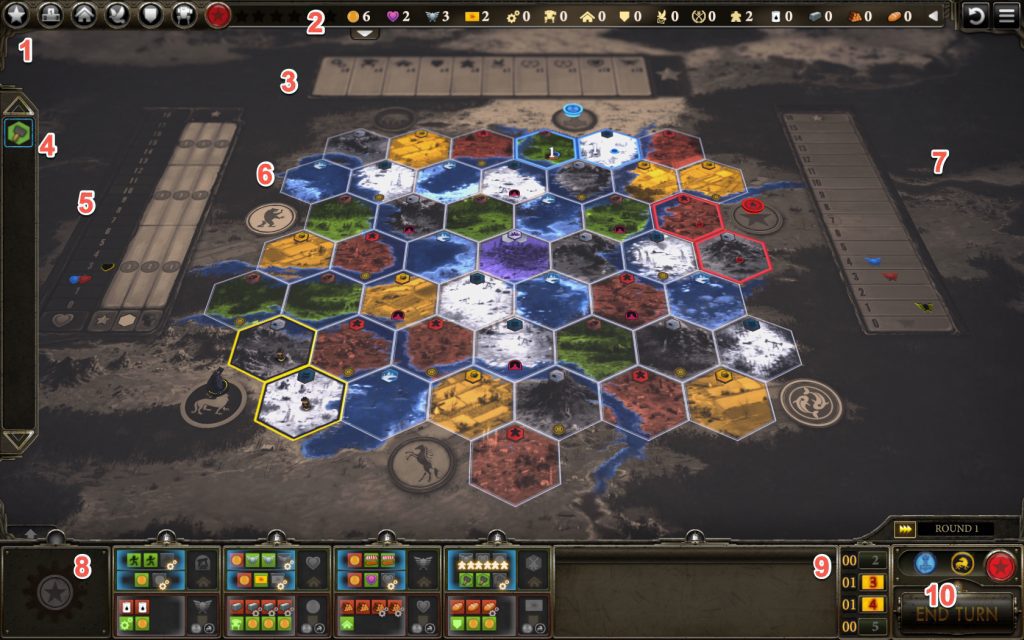
The bottom left area of your screen is a condensed version of the physical game’s Player Mat. This is where you choose your turn actions (top half) and/or make upgrades, build structures, deploy mechs, or enlist. The empty area in the far left corner is reserved for any Factory Action you may claim during the game.

To choose an upper action, simply click on that action. The main board will then highlight your options for that action.
Example: Production
For instance, let’s say Rusviet chose the Production action.
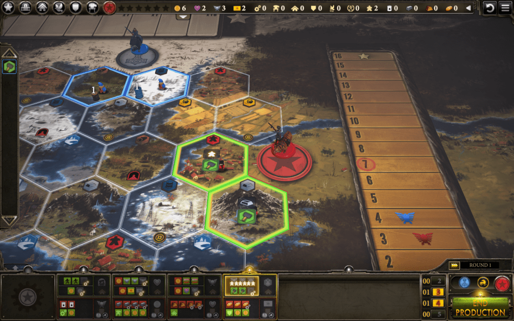
The app highlights all of the hexes where you have workers who can produce for you. As well, you’ll have the option to produce once for each worker (not shown here).
Example: Upgrading
If you’ve played Scythe you’ll know that upgrading your faction’s abilities is a standard opening gambit. Let’s take a quick look at how upgrading works within the app.
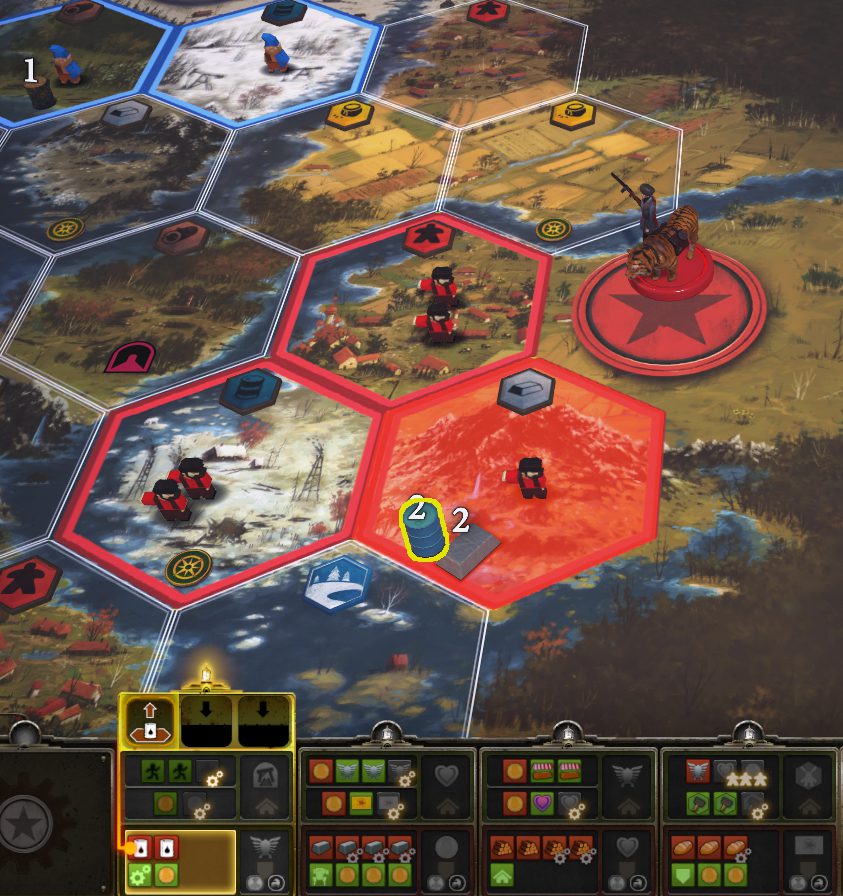
If you have multiple hexes with the necessary resource, you’ll be given the option of which hex(es) you’d like to choose from.
Once the necessary resources have been selected, your upper and lower level Upgrading options will highlight.
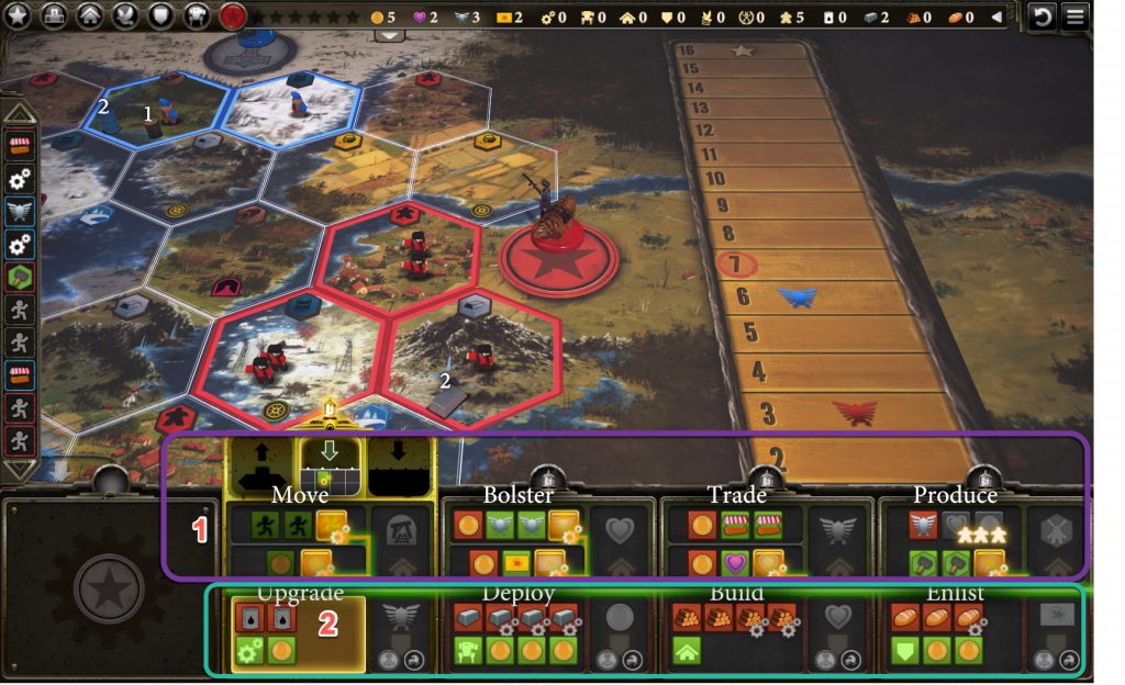
1) Any of the highlighted upper level items (framed in purple) can be chosen to be increased through this upgrade. Choose one… 2) … and then select a lower level icon with gears in the lower left corner to decrease its resource cost.
Encounters
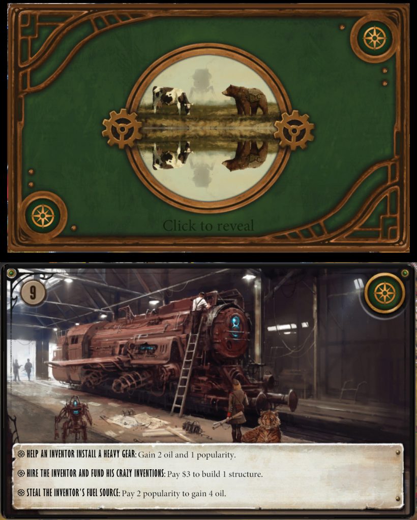
Jakub Rozalski’s evocative artwork is also on display whenever your faction’s character lands on an Encounter.
Combat
Battles between factions are handled a bit more dramatically in the app than in the physical game. Fights start with one faction moving mechs and/or workers and their character into the same hex as another faction’s mech(s) or character.
After doing so, when you end your turn, the screen grows dark and the hex to be fought over turns red. A bright red crosshairs icon appears as well.
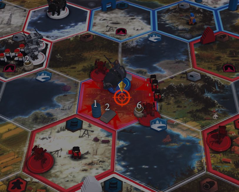
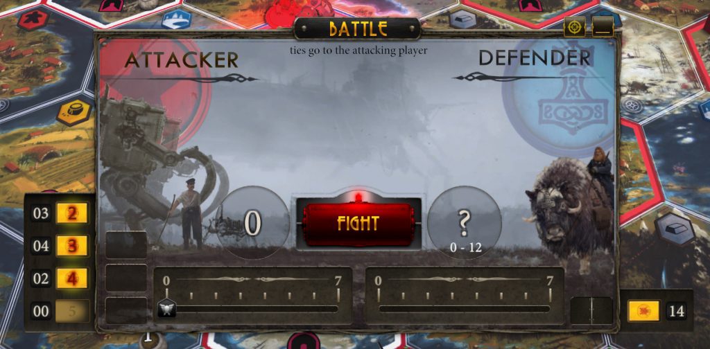
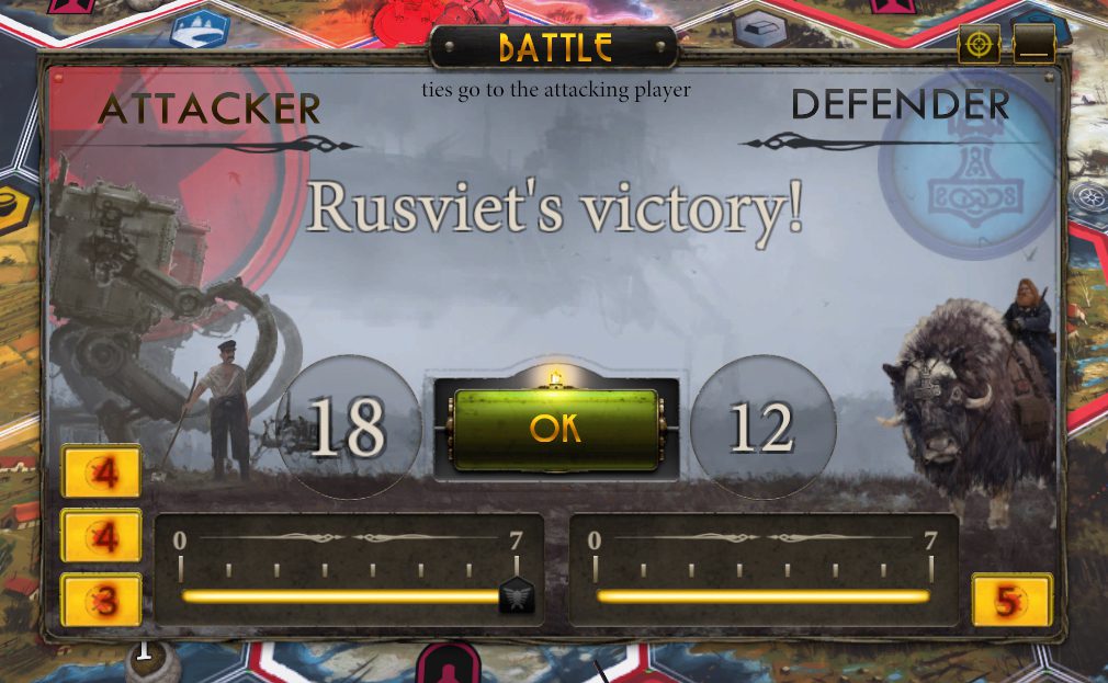
Your fighting capabilities—your Power and available Combat Cards—are listed on your side of the Battle window. Here, Rusviet is the attacker and has moved two mechs with workers into the hex. The two mechs give Rusviet the ability to play two Combat Cards. The People’s Army ability allows Rusviet to add in another Combat Card if a worker is present.
The other side of the Fight window shows your opponent’s capabilities, but only in general terms. In this example, the Nordic faction has at least seven Power. (Seven being the maximum Power you can deploy in a battle.) Nordic also has a total of 14 Combat Cards to choose from.
Knowing there’s a good chance Nordic is going to play 12, I decided to do some overkill for this example:
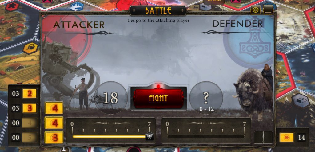
Battles in the physical game are a bit anticlimactic—you reveal your Battle dial and cards, then do some quick addition to see who has the highest total. In the digital version you simply click on the Fight button and the app takes over. While your number is visible, your opponent’s number slowly scrolls up the counter bar, giving it a touch of suspense.
End of Game
When the sixth Star has been placed, the end game is immediately triggered.
The opponents’ icons are displayed, along with their final Star count. Then each scoring category is added up for you.

Until a victor is shown.

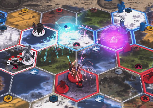
Let’s celebrate the victory with fireworks going off around the winning faction’s character!
Admin
For me, digital versions of board games will never replace the real thing. Sitting across a table from friends, talking, scheming, and reacting to their moves helps to create the kind of stories and memories I love most about this hobby.
However, one distinct advantage digital versions have over their physical counterparts (as I mentioned in my Terraforming Mars app review) is the ability to handle all of the admin functions of a game for you.
Just as the end of game point tally is so quickly handled, there are other admin functions that the app takes care of in ways that will make any gamer appreciative.
If you’ve ever played and/or put away a game of Scythe you know there are a lot of bits and pieces that need to be distributed, laid out, and dealt out. Starting a game with just a few clicks and then ending it by Quitting the app, makes setup and break-down a snap.
That aside, there are many more ways in which the app helps me play the game more intently.
? Movement
For instance, something that typically slows me down during the physical game is mid-to-late game Movement. After deploying my faction’s Riverwalk and +1 Step mechs I always have to stop and work out exactly where I can and cannot move. (I know I’m not alone in this, right?)
Here’s how the app helps with that:
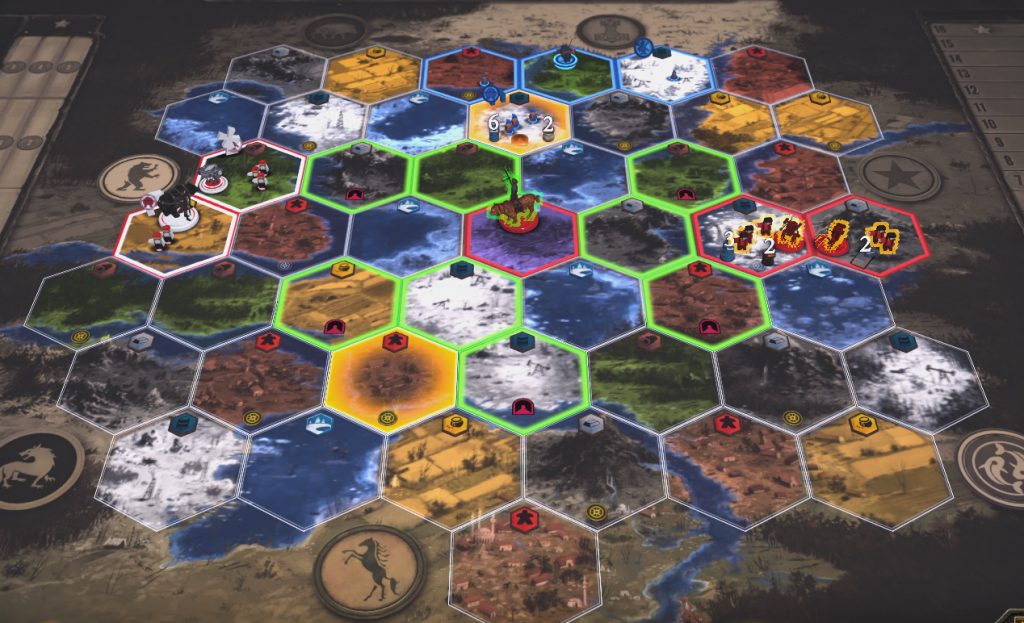
It makes such a strong difference that going back to Movements in the physical game now seems overly complicated.
? Progress Tracks
Not having a player board in front of you as a quick reference point—and your opponents’ boards in easy view—can make keeping track of progress a bit tricky.
At the top center of the main window is a quick reference guide to your current stats. This references your number of Stars placed, Coins, Popularity, Power, and number of Combat Cards.
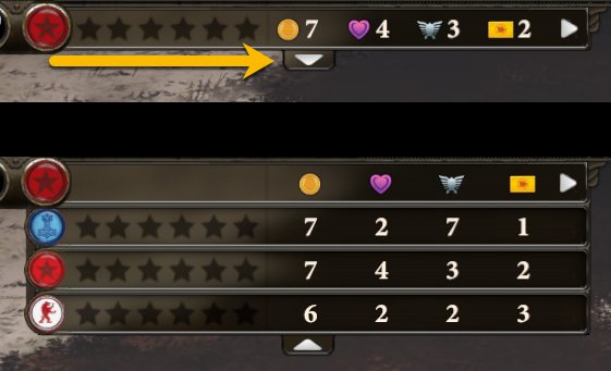
Keen-eyed readers will wonder about that arrow in the right corner of the stats bar.
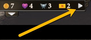
This expands your stats view to take in all aspects of your game including Upgrades, Mechs, Structures, Enlistments, Secret Objectives, Battles Won, Number of workers, Oil, Iron, Wood, and Food.
Click the down arrow and you’ll see the same full stat list for all players.

? Quick Star Tracking
As seen earlier, the Triumph Track is always at the top of the board. However, only the land hexes are readily visible in the standard view of the game board. To help with this, at any point in the game you can check the lower right corner of the main screen to see the number of Stars each of your opponents have placed. It’s a small touch that shows the app designers understand this important factor of the game.
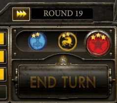
This doesn’t keep me from getting surprised all the time, but it has helped me out a lot.
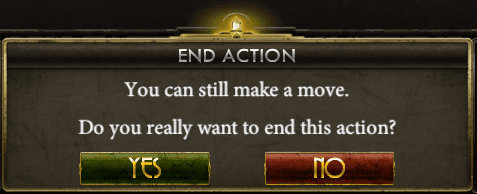
? Made All Your Moves?
Should you end your turn when you still have upper or lower level actions available to you, the app asks you if you’re sure you want to end your turn.
? Secret Objectives
Unfortunately, the app is not at all helpful when it comes to your Secret Objectives. There is nothing that indicates when you have met either of your Objectives. You’ll have to remember them or click on the Dove icon in the upper left corner of the screen to see them. Then, when you have completed an Objective, you’ll need to click into the Dove icon again just before ending your turn. The only way to get your Star for reaching a Secret Objective is to then end your turn by clicking the Complete and End Turn button.

Talk about unnecessarily awkward. Why can’t the Dove icon blink when you’ve met an Objective, followed by a pop-up window when you click the standard End Turn button?
? Resources Left Behind
I’m sure some people leave resources unattended by workers for some reason. I, however, am not one of them. If you’re going to helpfully ask me if I really want to end my turn without taking all of the actions available to me, is it too much to ask to have a similar message asking me if I really wanted to lose all of those resources by leaving them behind?
Final Thoughts
Terraforming Mars and Scythe have one trait in common: both are, essentially, multiplayer solitaire games. As I wrote in my Terraforming Mars app review, this is one of the strengths of the app—it allows me to play it as a true solitaire game without needing to pretend that other players’ actions will impact me. (Aside, of course, from potential territory invasions for Battle.)
The accompanying soundtrack for Scythe is a mix of musical styles. I’m going to guess the composer was trying for the different styles of music the factions might be familiar with. These range from stringed folk music to heavy, orchestral battle scene soundtracks. The latter seemed strange to me, given that Scythe’s Battles are not an integral part of the game. Scythe can, in fact, be a completely Battle-free game should the players so choose.
I have found myself turning the music down or pausing the game. The latter allows the music to reset, often to something less intense.
There are sound effects as well: the stomping of pieces moving to another hex, production items landing on a hex and then being used for Upgrades or Deployments, etc. These are not intrusive and help give a sense of reality to the on-screen actions.
On the initial Options screen there is a button for Paintshop. This allows you to stylize your workers, changing them from generic meeples to color-coordinated meeples reflecting their faction’s colors. I suggest you try blinging out your Scythe app with this easy to add feature. (All screen shots used in this review were done using this feature.)
Overall, the animation for the Scythe app is spot-on. When you move a mech or your character, they’ll swing in the air while you decide when to place them. I find this oddly satisfying.
I play the Scythe app to work on strategies and develop a better sense of balance and timing within the game. I like the overall attention to detail the designers and programmers put into this digital version and the relative swiftness of play allows a game to be played in under an hour.
It did not take long for the digital version of Scythe to win me over. It’s an impressive porting of the physical game, enlarging Rozalski’s beautiful art and streamlining much of the game. Since your AI opponents move more quickly than real life opponents, playing the app makes for a much faster and more intense experience.
If you’re a fan of the physical game, I recommend giving the app a try.






Add Comment