Beauty may be in the eye of the beholder, but whatever your preference, we’ve all had that experience of seeing a game’s art and knowing we just had to give it a play. Here are our picks for the most eye-popping games of 2020.
Don’t forget to cast your ballot in our 2020 Fan Favorite voting.
We’ll be announcing the rest of the nominees over the next few weeks; then check back on Friday, February 19, when we announce the winners of the 3rd Annual Diamond Climber Awards. Now without further ado, on to the nominees.
 Fort
Fort
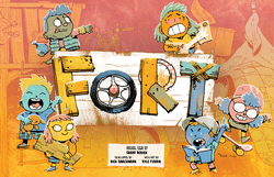
Good art design complements a game, enhancing the mechanics and drawing the players into the world. And there’s no doubt that Kyle Ferrin managed to do just that with Fort, creating a playground world of backyard forts and neighbourhood kids. Fort’s artwork deserves particular praise for its inclusion, with boys, girls, non-binary and wheelchair-users all represented. There’s a fizzy energy to the art; it’s chaotic, colourful and funny. The net effect is that players end up thinking of these children as real, scuffed-kneed and snotty-nosed, rather than simply as cards to collect and play.
Publisher: Leder Games
Designer(s): Grant Rodiek
Artist(s): Kyle Ferrin
Village Green
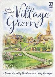 For what is essentially an abstract game, Village Green is absolutely gorgeous. Every card features lovely watercolours by the suitably-named Joanna Rosa of flowers, trees, statues and ponds. Laid on the table in the 3×3 grids they combine in such an evocative manner, triggering palpable memories of a hundred quaint villages and formal gardens. Very few games so perfectly capture their theme, the dappled sunlight, blooming roses cascading willows all transporting the players to the floral competitions of middle England in summer.
Publisher: Osprey Games
Designer(s): Peer Sylvester
Artist(s): Joanna Rosa
Read our review of Village Green.
The Dead Eye
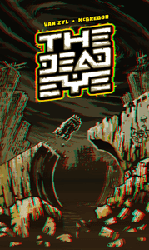 The Dead Eye takes place on an irradiated planet, a toxic dystopian landscape of poisonous flora and mutated fauna. Further enhancing the theme, The Dead Eye includes a short prequel comic book and 3D card imagery, complete with 3D glasses. Rob van Zyl’s stark yellow and black colour-scheme and pulpy punk-art images create a sense of dread and unease that seeps into the player’s subconscious, all without ever getting in the way of the stellar gameplay.
Publisher: Pleasant Company Games
Designer(s): Simon McGregor
Artist(s): Rob van Zyl
Read our review of The Dead Eye.
Rococo Deluxe
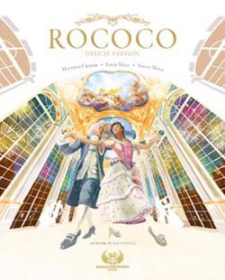 You’d imagine that a game about gowns, frock coats and fireworks set in the run up to one of Louis XV’s Grand Balls would be lavish, extravagant and stately. And you’d be right. Rococo Deluxe’s appearance is everything you could hope for and more. The board is an opulent palace, a place to see and be seen in, whilst the garment tiles and employee cards are intricate yet easy to read, full of telling details and humanity. The effect is a commanding table presence that somehow manages to be both over-the-top and elegant. Rococo Deluxe is sumptuous work from artist Ian O’Toole.
Publisher: Eagle-Gryphon Games, Geekach Games, Korea Boardgames co., Ltd., Maldito Games, Mosaico Jogos, Skellig Games, YOKA Games
Designer(s): Louis Malz, Matthias Cramer, Stefan Malz
Artist(s): Ian O’Toole
On Mars
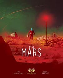 On Mars is far from the first board game set on the red planet, but it is perhaps the best looking board game set there. That it’s also the heaviest game set on Mars as well is a testament to just how good the art and visual design is. There are over 20 different types of tiles, tokens and cards yet despite everything going on it’s never overwhelming. The art is both stunning in its own right and supports the gameplay. It’s quite an accomplishment considering how rich and detailed the art is. Like with Rococo Deluxe, On Mars shows why Ian O’Toole is one of the most highly praised artists in the industry.
Publisher: Angry Lion Games, Eagle-Gryphon Games, Giochix.it, hobbity.eu, Maldito Games, Mosaico Jogos, Skellig Games, TLAMA games, YOKA Games
Designer(s): Vital Lacerda
Artist(s): Ian O’Toole
Oceans
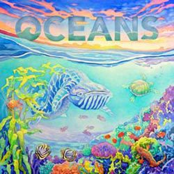 The Evolution series was already one of the most beautiful trio of games in modern tabletop, the vivid paintings of exotic animals fully portraying the psychedelic beauty of the natural world. But Oceans takes things one step further, moving the action beneath the waves and allowing artists Catherine Hamilton and Guiallaume Ducos to capture everything from the neon majesty of coral reefs to the terrifying monsters of The Deep. There are over 120 individual works of art in Oceans and every single one of them makes you want to jump in and explore the underwater world. Although, with cards including Tentacle Leech and Epizootic Parasite, you may perhaps just want to explore it from the comfort of your gaming table.
Publisher: Ediciones MasQueOca, Funforge, North Star Games, Pendragon Game Studio, Schwerkraft-Verlag
Designer(s): Ben Goldman, Brian O’Neill, Dominic Crapuchettes, Nick Bentley
Artist(s): Catherine Hamilton, Guillaume Ducos



 Fort
Fort



I read this article and I feel sad. I feel sad because all of these games look beautiful and none of these games are in my collection. 🙁
May have to correct that!
I absolutely agree. Reading up more on the nominees from the team to write this up just blew me away with how striking these games are. I find that games are just getting better and better looking, I go back to older favourites and whilst the gameplay holds up, the visuals seem lacking in comparison!