I won’t lie, I monitor the Kickstarter page for tabletop games daily. Okay, multiple times a day. The thrill of being the first to notice a new campaign and announce it on social media is a blast. Even as I write this piece I checked for the second time today and there are EIGHT projects that weren’t there this morning.
But even though I monitor Kickstarter so closely, I don’t actually back anywhere near the amount of Kickstarters I look at. So where’s the disconnect between my eyes and my heart? What makes one game appealing enough to back, while another game goes unnoticed? In this article I’m going to talk about the things that I find most appealing about Kickstarter campaigns and how they convince me to lay down the cash.
The Thumbnail
Unless someone links directly to a Kickstarter campaign page the primary way you might encounter a campaign is via a thumbnail on Kickstarter. Personal taste aside, I think there’s some level of objectivity that can be applied to a campaign thumbnail. Does it communicate enough information, but not so much that it feels crowded? Is it well designed? Is it colorful, or perhaps only black and white? A good thumbnail should offer just enough about the product to get you in the front door and onto the campaign page.
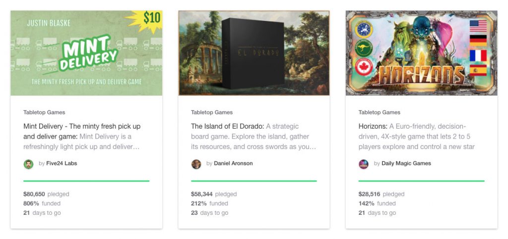
Here’s three great thumbnails in a row for campaigns which all funded. Let’s break down how these images contributed to the success of the campaign.
- Mint Delivery – Mint Works was a huge hit for Five24 Labs so they were likely going to fund Mint Delivery coming out of the gate. However, in a minimalist style true to their brand, the thumbnail is clean, well designed, easy to read and clearly states what the game is, and what to expect.
- The Island of El Dorado – This game from first time creator Daniel Aronson takes the opposite approach to Mint Delivery. The art on the thumbnail is lush and mysterious, while the box stands as a Kubrickian monument, almost daring the user to click and enter the campaign page.
- Horizons – Lastly the thumbnail from industry darlings Daily Magic Games states simply what you’ll get when you back the game. A box full of sci-fi adventure and international friendly shipping. They know what’s important to their backers!
The Video
The intro video is literally the first thing you’ll notice when you land on a Kickstarter campaign page. Thankfully, for almost all campaigns, your thumbnail and the video background are the same thing. Once you hit play though, that’s another story. There’s so many variables to discuss in video that I simply can’t cover them all. Kickstarter themselves have a great article on how to make an awesome video which is a good starting place. Important things to remember:
Good lighting – Having enough light is terribly important. Poorly lit videos, shadows, or color cast from certain types of lights can all affect whether people like your video, and go on to back your campaign.
Good sound – I get it, you don’t have a lot of money, and you’ll have even less of it if you shell out big bucks for a someone to record your video. If you can’t afford that, consider voice-overs. Film enough footage of you talking about your project to let people see who you are, then do voice-overs for the rest. You’ll be able to control the audio more effectively and the end result will sound much better.
Good footage – Make sure you’re filming your video with the highest quality settings your camera supports. 1080p is a minimum while 4k is your ideal. You can always go down in quality, but you can’t go up.
Good content – Good lighting, high quality video, and great sound won’t save your video if you don’t have something to say. Spend time scripting your content, blocking out locations where people will stand, where your product will be, and practice practice practice until you’ve got it right!
The Copy

The body copy of your Kickstarter campaign should be descriptive just like your thumbnail and video. This can, in some ways, be more important than either the thumbnail or video. The text of your campaign page will help people more easily find your campaign on search engines. Make sure your copy is rich and descriptive, using words that describe your product completely (including key details spelled out). Consider that some people might stumble across your campaign simply by searching for terms related to your product.
What if writing content isn’t your strong suit? That’s fine, but you’ll definitely want to find someone to do it for you. Maybe a friend or family member who has a certain flair for the written word. But if you don’t have that sort of person in your life it might be worth hiring a professional copywriter to take care of it. Describe your product as best you know how, and let them work their compositional magic!
The Photos
Good photography is both hard to achieve and critically important. It’s okay if you can’t afford to hire a photographer. . It’s still possible to have great photos for your campaign if you spend a little time before and after your shoot. Let’s see how that can work!
The Setup – When doing photography always try to do as much work as you can before you ever click the shutter. Shooting on your kitchen table? Clear it off and wipe it down. Don’t have a good lighting system? No problem, open the curtains and turn on all the lights. Look through the viewfinder on your camera, or phone, and check out what’s in the background. Make sure there’s no stacks of books, or dirt on the floor, or dogs sleeping. Photoshop is great but a good rule of thumb is “garbage in, garbage out”. Check out this video from well known photographer, and Youtube celebrity Peter McKinnon on how to improve your own photography.
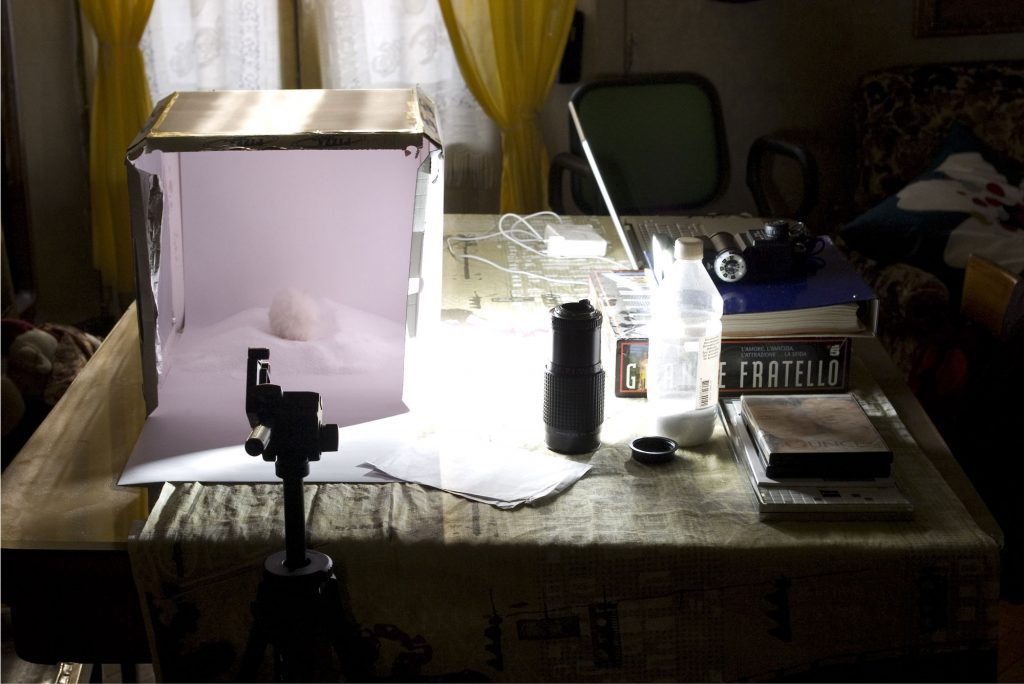
The Shoot – While doing your actual shoot try to minimize movement. If you do need to get shots from multiple angles, get all that you want before you rearrange or tear down your setup. It’ll be extremely difficult to come back and try to get everything the same. If you’re relying on natural light, make sure you get all your shots within a 30-60 minutes window to avoid differences in light from the change in time of day.
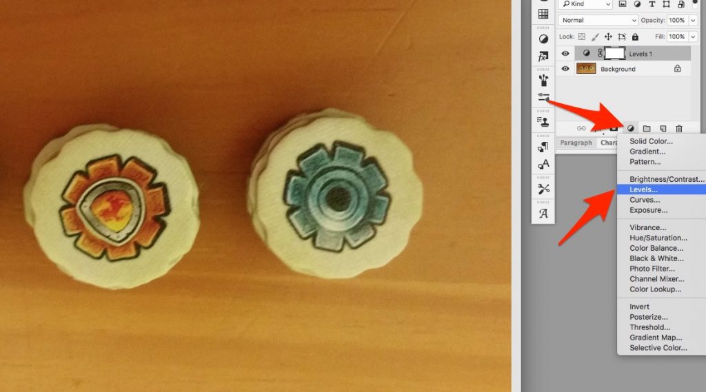
Post Production – If you’re taking pics with your phone (like I do), then Peter’s video on taking better shots with your iPhone will give you some really valuable tips, including a number of free apps that will dramatically improve the quality of your resulting photos. If you’re using Photoshop (like I also do) then one of the best, and easiest tips I can give you to improve your photos is as follows.
- Open a photo and create a new Levels adjustment layer.

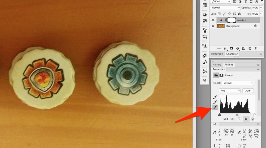
- Click the “white point” eyedropper tool

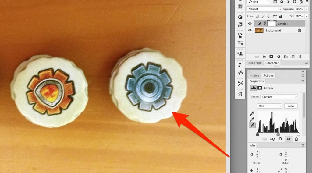
- Click an area of the photo which is supposed to be the purest white. In this example the rim of the cardboard token. You should end up with something more like this.

- This tip isn’t meant to be the end all be all, but if you do nothing more than color balance your photos with this simple tip then you’ll be better off than most campaigns.
The Reviews
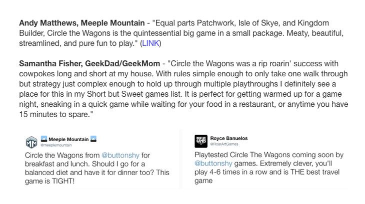
It’s a good chance that most people coming to your Kickstarter page aren’t going to know you, or your product. Some folks will take a leap of faith based on your thumbnail, video, content, and photos. The rest of the people you’ll have to convince. This is where reviews come in. Consider reaching out to prominent members of whatever community you’re marketing to and offer them a free sample in return for an honest review of your product. Video reviews are always great, written reviews are just fine as well. Post their reviews on your Kickstarter page along with a link to their comments or article.
The Stretch Goals
Stretch goals can be quite polarizing, most backers love them but they can offer an array of logistical challenges for organizers. You spend countless days calculating packaging dimensions, weight, and shipping costs, only to have them derailed when your backers hit that stretch goal that adds extra content in your box. Now you have extra weight which increases shipping costs, and maybe even increases the size of your box which means you have to get an upgraded price quote from your manufacturer.
For first time campaigns consider stretch goals that add value without adding much weight. Some campaigns are confident about their product and simply offer all the upgrades from the very beginning. This could be a good option for you too, but it’s one you’ll have to carefully balance. If you’re going into a campaign with a sizeable mailing list, or following on social media then consider involving those people in your decision, they’re going to be your most likely customers. Create a questionnaire using Google Forms and get feedback from your customers!
The Funding Goal
Even though arguably this is one of the most important aspects of a campaign, it’s the part I’m going to spend the least amount of time on. Backers are looking for a few things out of a campaign.
- They want to help a project they believe in succeed. Your existing network would love for your campaign to be successful.
- They want to get a good deal. Many times the Kickstarter price for a product is much better than what you might be able to purchase it for at retail, especially if you’re offering Kickstarter exclusives.
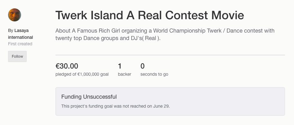
When setting the funding goal you have to thread the needle of asking for too much (and appearing to be greedy or scammy), and too little (and risk not earning enough to actually pay for production). First time campaign creators are at even more of a disadvantage. People are disinclined to back your campaign if they think you’re scamming them, or if they think you’re not likely to fund.
When setting your funding goal, make sure to run the numbers well and decide what your bare minimum for funding needs to be. As your funding goals increase, you can add value through the use of stretch goals without requiring them to succeed.
In Closing
There are so many variables that can contribute to the success of your campaign, and this article is by no means meant to be exhaustive. Remember these are just the things that people will experience on Kickstarter; we didn’t even discuss social media or leveraging your existing network of followers.
The Kickstarter platform really does crowdsource innovation and invention. It puts the decisions on whether something deserves to be created directly in the hands of those who might want it. I hope these suggestions will help your campaign be successful. Good luck, and may the odds be ever in your favor.




Nothing screams amateur hour on a KS campaign like terrible writing and grammar. Poor attention to spelling, clunky descriptions, or misuse of its/it’s, your/you’re, etc make me assume the same sloppy work went into the design and implementation of the game. An unfair leap? Maybe, but for me a KS has to overcome the fact that I’ve never set eyes on the game, let alone played it, so it has to broadcast its quality in other ways. “Your going to love this fast-paced game” doesn’t quite do that : )