If you have ever mused, “There ought to be a game about X…” then you have dipped a toe into game design. In most ways, “Design,” creating a game concept that did not exist before, is the easy part. Once you get over the paralysis of having too many choices (“There are HOW MANY game mechanisms?”) and fight off the unconscious bias of re-skinning existing games (“It’s Dead of Winter, but in space….”), then you can get to work creating the shell of something new and exciting.
“Development” is creating a tangible product, something that fulfills the intent of your design. So when your game features a deck of poker cards that houses the game’s randomness, development is making that set of cards. And re-making it when the design inevitably breaks. Development is not more important than design, but it is decidedly more challenging because you must both persevere and innovate while watching your design break, gasp for air, and break again.
I am part of the publisher Uplink Underground Games. Before I started making tabletop games, I had little appreciation for the difference between “design” and “development.” I now recognize that the two are separate and distinct, just like writer and editor, or architect and site foreman. But since indie board game designers often serve as their own developers, I had to learn when I was over-designing, thinking things to death in my own mind, and when I should have been developing, getting bits to the table. There is significant overlap between the two, a ping-pong back-and-forth especially in the early stages of a new game. But differentiating between “design” and “development,” and recognizing when you should do each, can avoid wasted effort and keep your production schedule on track.
So for all you aspiring game designers out there, let’s look at a specific example of how I learned to stop designing and start developing.
Start With a Core Concept
Our first game was Breakaway Football, a 1-4 player card-driven American football strategy game that features asymmetrical playbooks representing historic pro and college seasons. Though it plays pretty quickly (60 minutes solo, 90 minutes head-up), fans wanted an expansion to simulate fast games between non-coached teams so they could run complete seasons with all 16 available teams.
When you design a board game, start with clear constraints, which we discussed in our last article. Our constraints for Breakaway Football: Red Zone, then, were to build a “Super Sim” mode for solo play similar to the Madden video game. We wanted it to feel like you were watching an ESPN highlight package of a game, complete with rich storytelling. And it needed to play in about 8 minutes.
To minimize costs, we looked at reusing most of the existing components in the core Breakaway Football game, including fitting the expansion inside the core box. The largest costs were the custom card decks for each team and the Game Day deck that randomized luck. Therefore our simplest, most cost-effective solution was to create a new playing surface that would adjust the math of yardage gained, thereby compressing each Offensive drive into a single card pull. For this article, let’s focus only on the design and development of the playing surface.
Design 100% – Development 0%
This was the first board attempt.
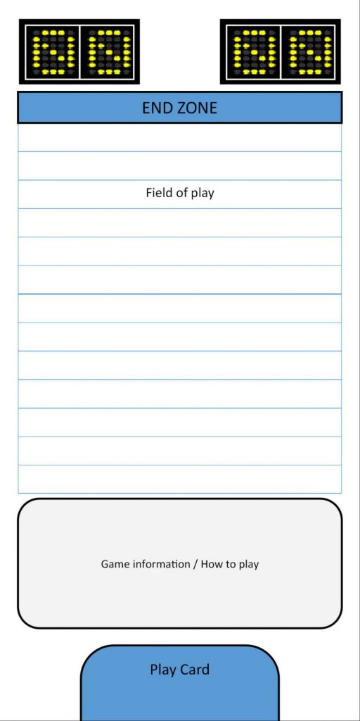
We saw it as a small, standalone board that would allow a team to “climb the ladder” towards their end zone. The rules reminders would sit under the ladder, and the Offense card would play in the blue slot. The lack of theming is intentional. We anticipated this version would break, and it did, almost immediately.
The next iteration, attempting to account for both teams instead of just one, was equally terrible.
Design 95% – Development 5%

Again you see the “climb the ladder” concept for both teams, as well as locations for the various Offense cards. But in play-testing, this board design unnecessarily complicated field position, so we quickly discarded it.
Design is trial and error. The faster you try, the faster you fail and, ironically, the faster you approach success. You know you are firmly in “design” when the game’s core mechanisms are fluid, most notably because the game keeps breaking. You know you are in “development” when the game is stable and fun but still needs work to smooth out balance, component aesthetics, and edge cases.
Therefore, rather than try to develop this broken design, throwing good time after bad, we tossed out the “climb the ladder” concept in favor of a traditional field.
Design 80% – Development 20%
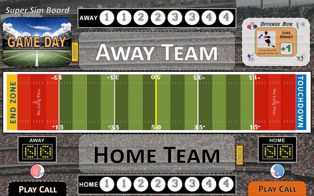
A major design success came when we segmented the field into 15-20 yard chunks, which allowed rapid yardage gains using existing cards from the core Breakaway Football. We had a ton of math to back up that design choice, which held solid for the rest of our development. We also designed a “Drive Summary” to record what happened on each possession. We added Away and Home team spots to hold small player mats for team AI.
Play-testing proved the field concept was working, so we started consciously shifting from “design” to “development.” The design wasn’t finished, though, because we saw too many Safeties compared to real football.
Design 50% – Development 50%
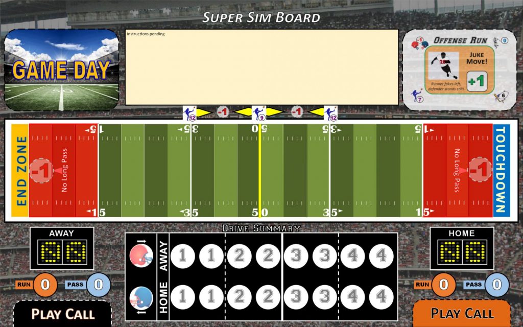
To fix that design issue, we added an extra spot on the field (the “-1” at either goal line) to allow for fewer Safeties and more interesting punting. We also added the “Drive Bonus,” where a team’s strengths and weaknesses would add yardage to the drive depending on the match-up. But our “development” choices were to combine the Drive Summary like a scoreboard, and to move play instructions to the top of the board.
Play-testing showed the design was rarely breaking, which was very encouraging. As a result, we moved almost exclusively into “development.”
Design 25% – Development 75%
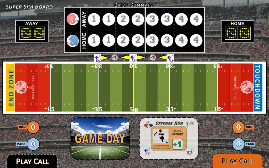
On the next board, the only design change was to add “-2” to the circular spot on the field. This choice completely fixed the nagging Safety problem. On “development,” we cleared the Drive Summary out of the player’s way and relocated the Game Day deck (used on every drive) to within easy reach. Because the game did not break anymore, we were done “designing.” We now could focus exclusively on form and function of our components.
Here is our final board:
Design 0% – Development 100%
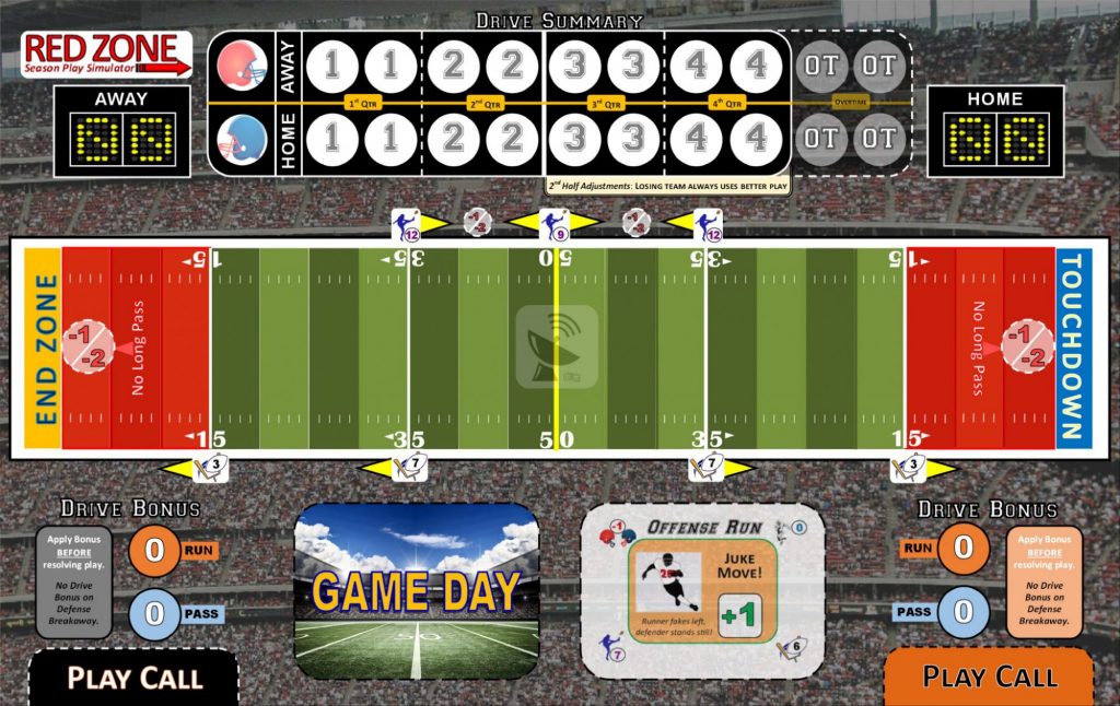
We were able to add more detail, like the Field Goal targets, description of how the Drive Bonus works, and reminder of 2nd Half adjustment rules. We cleaned up the presentation of the Drive Summary and added Overtime spots. We even added the game’s logo in the top left and the Uplink Underground Games logo as a watermark at midfield.
Our success was getting ugly prototypes to the table quickly to test if the design worked. Early concepts – like “climbing the ladder” – were glorious failures. But we only lost a week on it. The final product featured brand new tokens, a new playing surface, re-imagined AI charts for Defense, and a new set of rules. Despite reusing many of the components from the core Breakaway Football game, we built a new experience that serves a need and is fun to play.
Conclusion
So how can you use this to further your own designs? Most importantly, I recommend you avoid designing completely in your own mind. Also, don’t assume the “design” has to be perfect before you start “developing.” After all, the design tends to change as you build out (and discard) your game’s components. Remember to use design and development as complementary, iterative processes. And give yourself permission to fail, quickly and often, in pursuit of excellence.







Add Comment