I’ve been interested in making games for almost as long as I can remember. My childhood was filled with hastily scribbled rules, half-baked variants for existing games, and endless character designs and stories about different games that I’d never play.
Even as tabletop games started to gain popularity, it never occurred to me that I could actually be a game designer. I didn’t know the first thing about how games were made. In college I experimented with a few handmade prototypes, but I had no idea how to evolve them into something playable, much less something marketable. I spent hours hacking and homebrewing games with no thought that anyone, anywhere, would want to play something I made. On the rare occasion a friend might express interest, I’d sheepishly explain the rules as though I was violating the laws of nature. Game designers weren’t ordinary people; they were names written large across splashy graphics adorning heavy boxes.
When I started writing for Meeple Mountain, I suddenly gained access to a world I’d thought inaccessible. Publishers and designers were no longer remote mythical creatures. They were human beings who just happened to really love games—people who worked hard to make something that someone else might enjoy. People like me.
I still remember the moment that everything changed. In 2019 I attended an event for designers put on by Meeple Mountain: not as a designer myself, but as a curious student of games. Other people had paid their hard-earned money to run a table, demoing their games for a crowd of eager playtesters. Talking to one of the “real” designers, a stranger who would soon become a friend, I was asked a question I didn’t know the answer to: “If you’re not a designer, what are you doing here?”
That’s when I decided to become a game designer.
I studied everything I could. I joined design-focused communities like the Nashville branch of the Game Makers’ Guild. I learned how to make a quick prototype, how to use online platforms to host and run games, and how to make a pitch video. I entered contests and challenges, trying to make each of my games better than the last.
For all that I’d learned, I still felt like I was just a hobbyist. Imposter syndrome is common among game designers and I was no exception. The last step, the crucial thing that would fulfill a lifelong dream, would be getting signed and published.
My game, One Breath Left, is on Kickstarter as of today. If it funds, I’ll be able to complete that dream. It’s a surreal feeling, to be this close to releasing one of my designs, but when I look back on it I see the hours of effort that it took and the lessons I learned along the way. Hopefully some of the things I learned will also be useful for aspiring designers who are just now starting their own designer journey.
The Concept
One Breath Left originated with an idea I had in December of 2021. It was strongly inspired by two video games: Tacoma and The Return of the Obra Dinn. In both of these titles the player is investigating the site of an unknown disaster, trying to piece together exactly how things went so horribly awry. There’s no combat, no health management, no fancy gear. The danger has already passed. These types of games thrive on their ambiance and the quiet thrill of finding hidden details that lead to greater revelations.
Wanting to replicate this experience, I immediately thought of a solo roleplaying game with a journaling component, asking players to record what they find during their investigation. The space station setting from Tacoma (and The Station, a similar game) made a natural starting point. As a sci-fi fan, that type of setting really appeals to me, and I felt like I could easily create a handful of locations for players to explore. I gave my project the clever title of Space Station RPG and set to work.
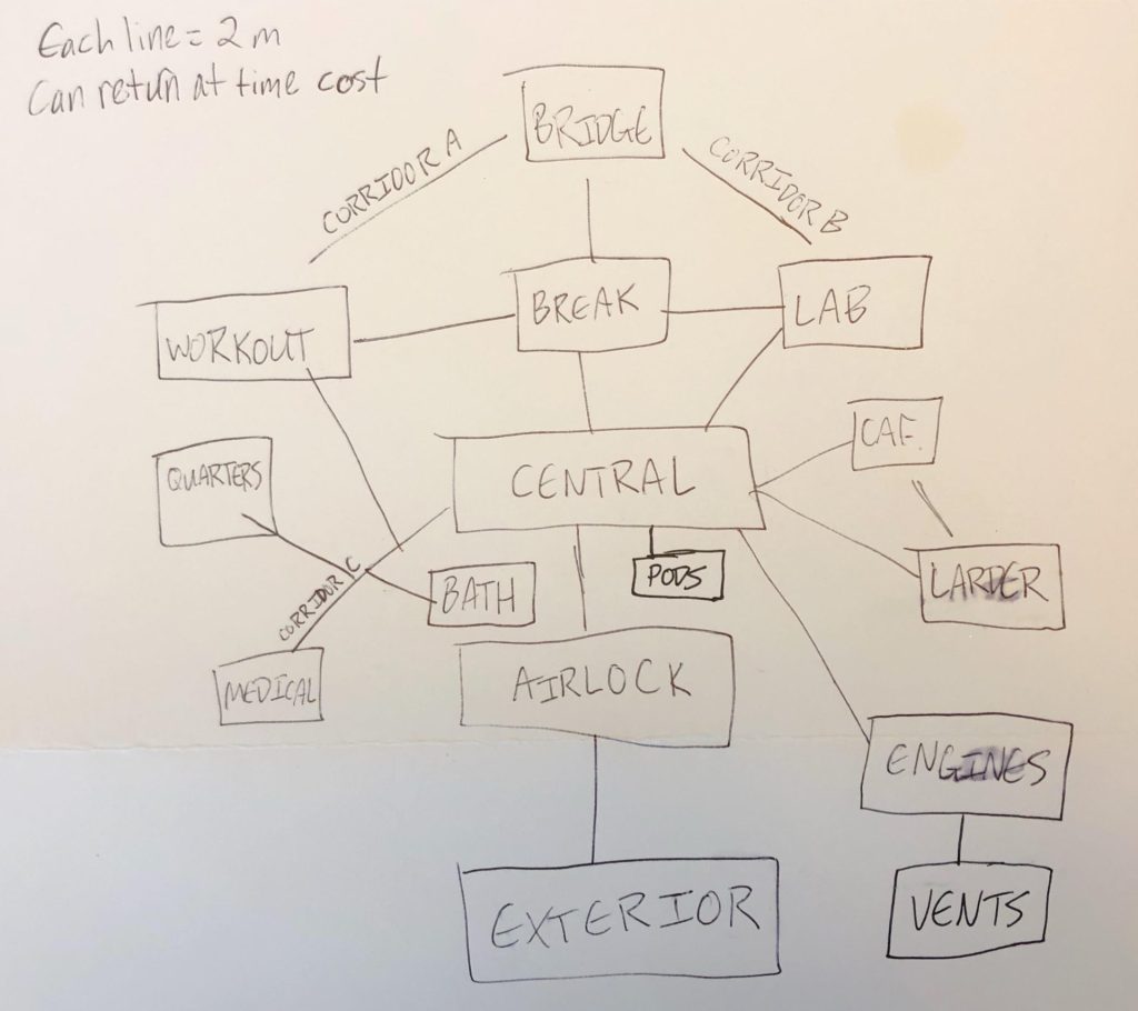
From my first attempt, replayability was on my mind. It was important to me that the game would be something you could come back to and solve in a different way–unlike the games that inspired it, which have fixed narratives that the player can only witness and never shape. There were two ways in which I addressed replayability: by providing the player with specific prompts that could be changed with each playthrough and by limiting what the player could access in any given playthrough.
The prompts were simple enough. As the player explored a room, they’d access certain prompts which they could answer in their journal. Open-ended prompts allowed players to change the answer based on what they had already seen. For example, one prompt had the player finding a single word scrawled hastily on a wall, with the player filling in the specific word (and its author) to fit the meaning they wanted. Was it a warning, a password to access sensitive information, the name of a loved one? The player could decide each time they came across that specific prompt. In this way, everything was always connected by an evolving, player-created narrative.
To help guide each playthrough, I introduced the concept of time management. Each playthrough started with a set amount of Time, which players would spend as they moved around the station. This prevented players from simply wandering around the station, completing every prompt and “finishing” the game in a single session.
Time was also used to determine which prompts the player could access. In the original version, Time was represented by dice; in order to complete a prompt, the player had to decide how much Time to spend and then roll a certain number of “successes” (5+ on a 6-sided die) on that many dice. Many rooms had multiple tiers; for example rolling 1 success might reveal a crew member’s memento from home while 3 successes would also uncover a journal entry (penned by a crew member) detailing some aspect of daily life on the station. This system of checks gave the game a slight push-your-luck aspect, encouraging players to consider how much Time they were willing to lose to get additional information.
Over the course of a week or two, I wrote out the full text of Space Station RPG, roughly 20 pages of rules and prompt-filled locations. I felt like I had something potentially really cool. After a few more weeks of revisions, I sent it out to a small handful of playtesters. The feedback that came back was really useful. It confirmed that the game worked, that it was interesting, and that it connected with players. I am beyond grateful for those early playtesters whose encouragement helped me decide what to do next.
The Pitch
At this point Space Station RPG was still just a text document. My original plan was to put it up for sale on the digital game storefront itch.io as an “ashcan”: a document whose content is mostly final but whose layout and graphics are not. While I wasn’t particularly excited about this option, it was about the best fate I could hope for and a common endpoint for indie RPGs. I knew I didn’t have the graphic design skills, time, or inclination to make the game prettier. If I got lucky and people liked it, maybe I could one day think about crowdfunding a better presentation. In the meantime, at least it would be out there.
In January of 2022, I came across a Tweet from Stout Stoat Publishing (then called Dungeons on a Dime) that changed everything. They were actively taking pitches for RPGs. They wanted to lift up debut designers. They were specifically looking for choose-your-own-adventure games, which Space Station RPG technically fit. I knew this was an opportunity I wouldn’t get again, so I decided I wanted to pitch.
First, I did a little research. Having never heard of this publisher before, I wanted to make sure I was sending my game to someone trustworthy. I looked through their website, social media, previous crowdfunding attempts, and reviews of their products. Stout Stoat is owned and operated by Brian Tyrrell, yet something that really stood out to me was how different each of their releases felt. Scurry, a small-creature adventure game, had a distinct style and tone from Carved in Stone, an RPG resource focused around Scotland’s history and the Picts who defined it. It was clear that Stout Stoat was dedicated to making small, beautiful works with high-quality art and layouts: the exact things that I knew I wouldn’t be able to do on my own.
Having decided to pitch my game to Stout Stoat, I spent a few days trying to make Space Station RPG into a more palatable product. I downloaded some art (making sure it was available for commercial use, just in case) to make a cover page, chose a few of the most interesting locations in the book to submit as sample pages, and retitled the game to These Empty Spaces.
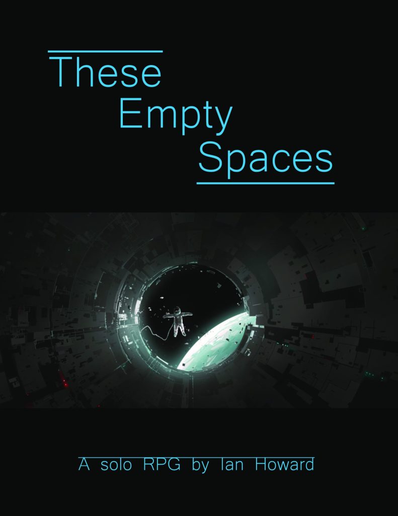
Pitching a game is always stressful. Thankfully the process for this pitch was easier than most. I filled out a single Google Form, including all the requested information. Over time I’ve learned a key thing about pitching: lean into what makes your game interesting rather than getting lost in details. You are trying to sell your game, not teach it. Briefly describe the main mechanic(s) and how it creates interesting situations in play, but don’t worry too much about explaining all the rules. Run your pitch past people you trust to see what they think. Does the pitch excite them and make them want to learn more? If so, you’re on the right track!
For These Empty Spaces, I tried to focus on the game’s most salient aspects: the sci-fi setting, the blend of choose-your-own-adventure and solo journaling, and the use of Time to limit how much of the station was investigated during a playthrough. I included one sample page explaining how the check system worked and one or two sample pages showcasing particularly interesting rooms. My goal was to show off what I liked about the game and how it should make the player feel. Once I was satisfied that I’d presented the game as best I could, I crossed my fingers and submitted the form.
The worst part of pitching a game is, of course, the long wait to hear back. Many publishers simply don’t have the time to respond to submissions that aren’t accepted, which can leave aspiring designers wondering whether their work is still under consideration. In this case, the pitch request outlined that it would take at least 6 weeks to get a response. I tried to forget about These Empty Spaces as I worked on other projects. From time to time I would think about coming back to it, but I was hesitant to make any changes while the pitch was pending. Not that I had a lot of changes to make: naively, I felt confident that the book could be published as-is, with mostly cosmetic changes like a proper layout and some art assets to make it look prettier.
In February of 2022, I got an email back from Stout Stoat suggesting that we meet to discuss publishing the game. While most publishers are not able to offer in-depth feedback, the email Brian sent included some generous evaluations on what was and was not working with the design. Reading through it, I realized that there was still a lot of work left to be done.
But what really excited me was a tantalizing vision that Brian offered about the future of These Empty Spaces: rather than a single book, he suggested, what if the game used a small set of cards to create unique, procedurally-generated ships?
The Signing
Brian and I met at the end of February, and I have to admit I was quite nervous. Because the game was already pitched electronically, I didn’t need to show Brian any of the gameplay or conceptual elements. I knew he was at least somewhat interested. In other words, this was about as friendly a situation as it could possibly be, and I was still sweating bullets as I connected to our video call.
I shouldn’t have worried at all.
Right away I felt like Brian and I instantly connected. He was warm and friendly, encouraging me about the design while also being honest and realistic about its weak points. And there were a fair number of weak points. As a novice designer, it’s easy to get caught up in what’s great about your game and overlook its failings. This is why playtesting and external feedback are so crucial. One of the best aspects of pitching a game is the opportunity to get professional feedback, even if it’s not always what you want to hear.
In talking with Brian, he highlighted the fact that despite my best efforts the initial design lacked replayability. While you could play through the book multiple times, there wasn’t a compelling reason to do so. All of the locations were prescriptive: you could answer the open-ended prompts in new ways, but you couldn’t ever have a meaningfully different experience.
Brian’s solution was to add a deck of cards or tiles which could be dealt out to create the shape of the station as the player moved through it, using the book as the directory to determine what could happen in each room. Though I’ve designed quite a few small card games, the idea of using cards for the ship locations hadn’t occurred to me until Brian suggested it and truthfully I wasn’t initially sure about the idea. Making a single book with a limited branching narrative was hard enough; making a combination card-and-book game with extremely open prompts and a highly variable narrative was a much more daunting task.
The more we talked about it, the more convinced I became. By the end of the meeting, I felt like Brian’s vision for the game would lead to a better product and a better experience than anything I would have come up with on my own. I was thrilled when he said he’d send over a contract. Thankfully the contract I received was straightforward and easy to parse, with a fair amount of protection for me as a designer.
Contracts for game design can be tricky, especially for newcomers. While actual scammers are rare, there’s a lot of potential for designers to be taken advantage of with predatory or misleading contracts. I’m not a lawyer and cannot give out any real legal advice. If you are at all unsure about a contract, make sure that you speak with a qualified legal expert to determine what’s best for you. In my case, I did a bit more internet research to learn about a few common pitfalls.
One really notable issue is to make sure that the designer’s work remains their intellectual property. Though the mechanical aspects of a design are difficult to copyright (as discussed in our guide to board game intellectual property law) it is important to retain control of your own work. There should also be clear guidelines on when and how the rights to the design revert to the designer; this prevents publishers from sitting on a design for years without making any meaningful progress.
Beyond that, there should be clear indications of how payments will be handled. The contract should lay out whether there will be an advance, a lump sum on delivery, a royalty structure, or some combination of the above. How much will be paid and how often will it be paid out? These are basic aspects of the contract that must be addressed and resolved to both parties’ satisfaction before signing. If you aren’t comfortable with the contract, you absolutely should ask the publisher whether they’re willing to make changes; how they handle that request will tell you a lot about what your working relationship will be like.
And that relationship is important, because once you’ve signed the contract the real work begins.
The Development Process
These Empty Spaces was signed at the tail end of February of 2022. The Kickstarter started August 8th, 2022. That’s roughly five months. So what were we doing that whole time?
Development.
As Meeple Mountain contributor Art Franz wrote in his article Stop Designing, Start Developing, “development is creating a tangible product, something that fulfills the intent of your design”. Development is the hard work that turns a raw design into a polished game. The most obvious piece of this is calibrating the mechanical pieces: tweaking numbers here or there to make sure everything is nicely balanced and there aren’t any game-breaking strategies. The truth is that this kind of fine-tuning is just one aspect, and each game requires a unique development process that can range from very minor tweaks to wholesale redesigns.
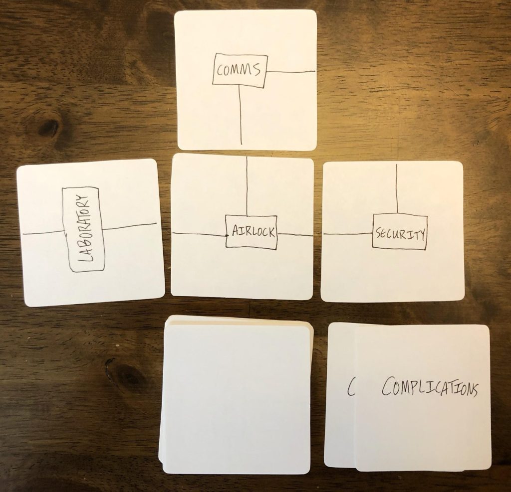
In this case, it was a lot closer to a redesign. By adding cards, Brian and I were fundamentally changing the game. We immediately set about figuring out how to incorporate the cards in a way that felt holistic. It quickly became apparent that we would want square Euro-style cards so that rooms could align properly, connected by doorways extending off of the edges. This method has been seen in quite a few tile-laying games, making it feel comfortable and familiar for many players. After we got that basic mechanic in place, it was time to turn our attention to the narrative part of the game.
One thing Brian and I talked about early on was defining the Explorer, the name we used for the player’s character. In my original draft, the character was a cypher, with only as much background as the player cared to include. The video games that inspired my idea all highlighted the intricate mysteries of the plot at the cost of having no player customization or engagement. As this game began to change, we knew that we needed more ways to connect players to the concept.
Through our discussions we developed three major setup categories that could be used to hook players. Before each playthrough, the player would pick one of each element: an ID Badge that described their character archetype, a Contract that defined their primary goal during play, and a Manifest that introduced the specific type of disaster that the Explorer needed to investigate. By combining these options in different ways, we could support players in telling a wider variety of stories.
We also began to evolve the world, adding aspects that fit with the kinds of sci-fi and horror themes we wanted to touch on. Over time we gradually shifted the emphasis from exploring a space station to exploring wrecked spaceships, a clear improvement that made it feel more natural and tied it more closely to other sci-fi narratives. Most importantly, we changed the nebulous concept of spending Time to something much more concrete and immediate: Oxygen. This gave the game a powerful driving narrative, with the player now racing to accomplish their Contract while watching their reserves of Oxygen dwindle away to nothing.
The real breakthrough moment came when we finally jettisoned the most cumbersome part of the design: the dice. I’d been adamant for much of the process that tracking Oxygen with dice and the accompanying roll-for-success system needed to stay. To me, they were the game’s signature mechanic.
Something that’s incredibly difficult for new designers is learning how to cut things from a design in order to make a better experience. I loved the idea of rolling 50 or 60 dice over the course of a game and having to strategize around the randomness of those rolls. But as an experience, it just didn’t work. The dice were generally more frustrating than interesting. They required more tracking and more steps. They also presented a barrier to play: we had limited space and funds to include extra components, and most people don’t have that many dice laying around! It was painfully obvious that the dice were holding back the design. They had to go.
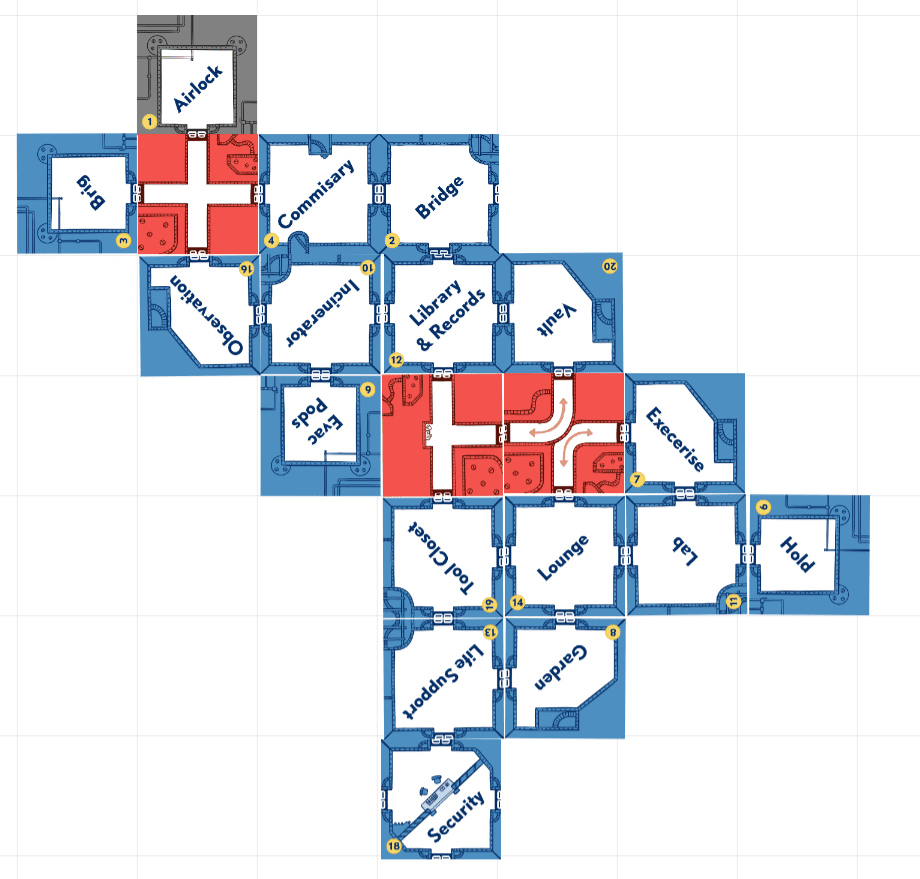
Removing the dice allowed us to make Oxygen more focal: instead of converting it to rolls and then winnowing that to successes, now each point of Oxygen directly contributed to progress on a track in the appropriate room. Spend enough Oxygen and success is guaranteed, but each breath you spend is one less you’ll have to escape when everything starts going wrong.
And plenty of things will go wrong! While the original concept was a danger-free stroll through the wreckage of someone else’s worst day, it felt very dry. To amplify the tension, each Manifest (which details the specifics of the Wreck being explored) adds a specific Peril track which overlays the player’s Oxygen track. These unique Peril tracks trigger game-changing events at varying points in the playthrough. Not only did this give each Wreck its own character, but it also allowed us to lean into different types of tension: a lurking alien monster will feel very different from a ship that’s literally breaking apart.
Having polished the core of the game into something that was compelling, all that was left was to fix the name. We tossed around a lot of ideas, trying to capture the essence of the gameplay. Finally we settled on the name that best reflected the game’s major tension point: how are you going to make it out of the ship when your Oxygen reaches critical levels?
What had once been called Space Station RPG became, at last, One Breath Left.
All of these changes made One Breath Left into a better game and a more interesting product. Every step advanced the core design, stripping away the elements that weren’t working and emphasizing the ones that were. Developing a game isn’t easy and it’s not always fun, but it’s the most important aspect of game design. Putting in the effort will undoubtedly help you become a much better designer.
The Kickstarter and Beyond
As for what comes next, only time will tell. Putting together a Kickstarter is a massive undertaking, and as a debut designer I was more than happy that Brian took the reins (as most publishers will). If you’re looking to launch your own Kickstarter, you might want to read our article on what makes a great Kickstarter campaign or our guide to Kickstarter marketing.
Assuming all goes well, One Breath Left will be in backers’ hands in 2023. The thought of someone playing (and hopefully enjoying!) a game that I designed is a powerful reminder of why I started designing games. Having gone through this process once, I feel like I have a better understanding of what makes a good game.
Regardless of how the Kickstarter goes, I’m proud of what I’ve done and grateful to everyone who encouraged and supported me in this project. If you’ve been thinking about getting into game design, know that it’s hard and often frustrating work…but the joy of putting your design out into the world is well worth it.
And if you’re interested in backing One Breath Left, check out the Kickstarter today!





Backed!